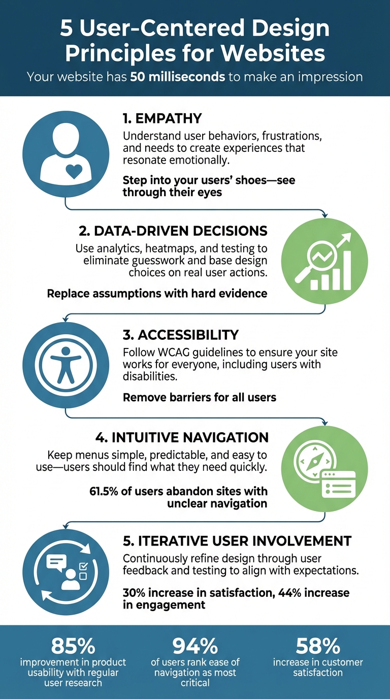
Your website has just 50 milliseconds to make an impression. That’s how quickly users decide whether to stay or leave. To make those moments count, focusing on user-centered design (UCD) is essential. UCD ensures your website meets real user needs, not just assumptions, by emphasizing usability, accessibility, and seamless navigation.
Here’s a quick look at the 5 principles that can transform your website:
- Empathy: Understand user behaviors, frustrations, and needs to create experiences that resonate emotionally.
- Data-Driven Decisions: Use analytics, heatmaps, and testing to eliminate guesswork and base design choices on real user actions.
- Accessibility: Follow WCAG guidelines to ensure your site works for everyone, including users with disabilities or limitations.
- Intuitive Navigation: Keep menus simple, predictable, and easy to use, ensuring users can find what they need quickly.
- Iterative User Involvement: Continuously refine your design through user feedback and testing to align with user expectations.
These principles not only improve user satisfaction but also boost engagement, reduce bounce rates, and align with business goals. Let’s dive deeper into how you can apply each one.
5 User-Centered Design Principles for Effective Websites
Principles of User-Centered Design [ With The Help Of Examples] #usercentereddesign #uiuxdesign
sbb-itb-94eacf4
1. Empathy
Empathy is the foundation of user-centered design. It’s about stepping into your users' shoes - seeing your website through their eyes, understanding their needs, frustrations, and limitations, rather than relying on assumptions made by designers.
"Empathy is the heartbeat of user-centered design. It pushes us to understand the why behind user behaviors - not just what they do, but what they feel, think, fear, and need." - Sneha Mehta, Design Principles Author, Octet Design
This perspective goes beyond just making a website functional - it’s about how the experience resonates emotionally. Does your site feel inviting or overwhelming? For example, when designing for older users, empathetic designers might prioritize larger fonts and clear, bold calls to action to account for common vision challenges.
The impact of empathy in design is clear. A dental website targeting a Dutch audience initially suffered from high bounce rates. The issue? A cultural disconnect: overly whitened teeth were perceived as "fake." By shifting to professional, straightforward content that resonated with local expectations, the problem was resolved.
To build empathy, try navigating your site under different constraints - like in a noisy environment, with limited time, or using assistive technologies. Create detailed personas to humanize your audience, such as "Samantha, a busy small business owner." Tools like screen recordings and one-on-one interviews can also uncover emotional responses that raw data might miss. These methods help reveal the "why" behind user behavior, setting the stage for data-driven decision-making, which we’ll explore next.
2. Data-Driven Decision-Making
Empathy might help you understand why users act a certain way, but data shows you what they’re actually doing on your site. Tools like analytics, user feedback, and testing replace guesswork with hard evidence. This is crucial because designers often fall into the trap of the "false-consensus effect" - assuming users think and behave like they do. In reality, only 62% of senior executives feel confident in their ability to see things from their customers' perspective.
The magic happens when you combine quantitative data - like clicks, bounce rates, and time on page - with qualitative insights from tools like surveys or session recordings. For example, pairing heatmaps with user interviews can uncover not just where users are clicking, but also why certain elements confuse or attract them.
Here’s how to get started:
- Track behavioral patterns: Clickthrough rates and user flow paths help you understand engagement levels.
- Use heatmaps: These show which parts of a page grab attention and which areas are ignored.
- Analyze session recordings: Look for signs of frustration, like rage clicks, which might signal broken links or unclear design elements.
- Funnel analytics: Pinpoint exactly where users drop off during the conversion process.
- A/B testing: Compare design variations to identify what works best.
"Data can inform that intuition but ultimately it's up to you to draw conclusions and make design decisions based on your own experience and knowledge of the end user." - Mixpanel
The process should be iterative. Start by gathering baseline data, then develop hypotheses for improvement, implement changes, and measure the results. This constant feedback loop ensures your site evolves based on real user behavior, not just designer assumptions. Plus, this approach naturally ties into making your site more accessible to all users - a topic we’ll dive into next.
3. Accessibility Best Practices
Accessibility ensures that everyone can use your site, regardless of their abilities or circumstances. While data shows what users are doing, accessibility removes barriers that might prevent them from fully engaging. And here's the thing: making your site accessible doesn’t just benefit people with disabilities. It also helps users trying to navigate a site on their phone in bright sunlight, watch videos in noisy environments, or deal with slow internet speeds.
The foundation of accessible design is the Web Content Accessibility Guidelines (WCAG), with version 2.2 being the latest standard. These guidelines are built around four core principles - POUR: content must be Perceivable (users can sense it), Operable (users can interact with it), Understandable (users can grasp the content), and Robust (it works across various browsers and assistive tools). Most websites aim for Level AA conformance, which addresses major barriers without requiring the most advanced fixes.
To start, focus on a few key steps that make a big difference. Adding alt text to images allows screen readers to describe visuals to users who can’t see them. Make the descriptions functional - rather than saying “image of a magnifying glass,” simply label it as “Search”. Ensure your site supports keyboard navigation, as many users with motor disabilities can’t use a mouse. All buttons, forms, and menus should work with the Tab and Enter keys, and the focus indicator should remain visible. For text, maintain a contrast ratio of at least 4.5:1 between text and background colors, and make sure the site works when zoomed to 200% or even 400%.
"The web is not a barrier to people with disabilities; it is the solution. It has the potential to revolutionize their daily lives by increasing their ability to independently access information, communication, entertainment, [and] commerce." - WebAIM
Beyond technical compliance, focus on usability. Use semantic HTML with proper headings (H1, H2, H3) so screen readers can easily interpret your page structure. Clearly label all form fields and programmatically link those labels to inputs using the <label> element. Avoid relying solely on color to convey information - add icons or text labels alongside color cues. These steps do more than meet accessibility standards - they create a better, more inclusive experience for the millions of people who depend on assistive technologies to navigate the web.
4. Intuitive Navigation
Navigation serves as the guide for your website, helping users understand where they are, what options they have, and how to get where they want to go. Without clear navigation, a staggering 61.5% of users will abandon your site. And with less than 20 seconds to capture someone’s attention, your navigation plays a critical role in keeping them engaged.
The key to intuitive navigation lies in simplicity and consistency. Keep your primary menu concise - stick to 3–8 items to avoid overwhelming visitors with too many choices. Place elements where users naturally expect them: a logo in the top left that links to the homepage, the shopping cart in the top right, and the main menu across the header. This predictable layout helps users form a mental map of your site, making it easier to navigate. Pair this with clear labeling to further enhance their understanding.
When it comes to labels, clarity is everything. Follow the "Four S's" - labels should be specific, sincere, substantial, and succinct. For example, use straightforward terms like "Admissions" instead of vague or overly creative phrases like "Request Process". Breadcrumbs are another great addition, as they provide users with a clear sense of where they are within your site’s structure. And don’t forget the search bar - it should be easy to find and allow users to refine their queries directly from the results page.
"Don't make me think." - Steve Krug, UX Professional
These principles don’t just apply to desktops - they’re equally important for mobile users. With an estimated 7.41 billion smartphones in use globally by 2024, your navigation needs to work effortlessly on smaller screens. Use collapsible menus or tabs to save space, and ensure touch targets are at least 44 x 44 pixels to make tapping easier. Test your navigation by assigning specific tasks, like finding the pricing page; if fewer than 80% of users can complete the task, it’s time to rethink your structure. Ultimately, any key page should be reachable within two clicks from the homepage.
5. Iterative User Involvement
Taking the foundation of data-driven insights and accessibility improvements a step further, involving users continuously in the design process allows for meaningful refinements. The best websites aren’t static - they evolve by collaborating with users throughout the journey. When you see users as active partners instead of passive validators, you move away from guesswork and start creating solutions that genuinely resonate with them. This approach complements earlier points about empathy and data-driven strategies, ensuring that each iteration reflects real user behavior.
The impact of this method is clear: regular user involvement can increase satisfaction by 30% and engagement by 44%. It also eliminates the risk of relying on designer assumptions, ensuring your design aligns with how people naturally interact and think.
To make this work, focus on short design-test cycles. Use low-fidelity prototypes like sketches or wireframes to gather feedback early and often, rather than waiting until the end. Maintain a small group of design advisors who can provide consistent input. Watch screen recordings to observe how users naturally interact with your design, and conduct usability tests with specific tasks - if users struggle, you’ll know exactly where changes are needed.
"Users should be collaborators, not validators. From ideation and sketching to prototyping and iteration, their feedback should actively shape the solution." - Sneha Mehta, Octet Design
This iterative approach isn’t just effective - it’s also cost-efficient. Fixing usability issues during prototyping is far cheaper than addressing them post-launch. Plus, a user-friendly design reduces support tickets, as visitors can navigate your site without unnecessary frustration. Regular testing with a diverse group of participants, reflecting various demographics and accessibility needs, ensures your website serves everyone - not just a specific subset of users. This continuous refinement keeps your design intuitive and accessible, reinforcing the improvements discussed earlier while staying aligned with real-world needs.
Conclusion
Replace designer guesswork with genuine user feedback to create websites that genuinely meet user needs. By doing so, you craft experiences that feel natural, reduce confusion, and improve accessibility. The five principles - empathy, data-driven choices, accessibility, intuitive navigation, and iterative involvement - lay the foundation for a user-focused design approach that delivers real, measurable outcomes.
Regular user research can make a huge difference: it can improve product usability by 85% and increase customer satisfaction by 58%. A 2019 survey even revealed that 94% of users ranked ease of navigation as the most critical website feature. These aren't just small tweaks - they can significantly affect your business performance.
"User-centered design takes away the guesswork by incorporating user feedback at every stage of the web design process." - Webflow Team
The best part? You don’t need to start from scratch or hire extra staff to apply these principles. Modern website builders make it easier than ever, offering responsive frameworks, built-in accessibility tools, and analytics integrations. Top Website Builders (https://topwebsitebuilders.org) is a great resource for finding tools that suit your needs, whether you're new to web design or a seasoned pro. These platforms offer features like visual editors, mobile previews, and accessibility checklists that help you stay focused on creating user-friendly sites.
The bottom line is clear: when you make users the priority throughout your design process, you build websites that people enjoy using. The results? Lower bounce rates, fewer support requests, and higher conversion rates - all because visitors can navigate smoothly and achieve their goals without frustration.
FAQs
How do I start user research with a small budget?
If you're working with limited funds, user research doesn't have to break the bank. Instead of spending heavily, focus on techniques that demand more of your time than your money.
Start by testing your website's landing page or key screens with a small group of users. Even a handful of participants can provide valuable insights. To encourage people to take part, consider offering non-monetary perks like free access to your product or service.
Another option? Dive into lean UX research. This approach involves running quick, small-scale studies and analyzing the results promptly. It’s an efficient way to make informed design choices without racking up high costs.
Which accessibility fixes should I prioritize first?
To make your website or application more user-friendly for individuals with disabilities, start with these essential adjustments:
-
Add Descriptive Text Alternatives: Ensure all non-text content, like images and icons, includes appropriate
alttext. This allows screen readers to convey the content's purpose to visually impaired users. - Improve Color Contrast: Verify that text stands out clearly against its background. Sufficient contrast makes reading easier for users with visual impairments or color blindness.
- Streamline Navigation: Create a navigation system that's not only clear and consistent but also fully operable via keyboard. This is crucial for users who rely on assistive technologies or cannot use a mouse.
By addressing these common barriers, you align your platform with accessibility guidelines and make it more inclusive for everyone.
What’s the easiest way to test if my navigation works?
Tree testing is one of the simplest methods to evaluate your website's navigation. It helps determine if users can effortlessly locate content within your menu structure. This process pinpoints whether your labels and categories make sense to users. On top of that, usability testing - either with actual users or through tools that simulate user interactions - can quickly uncover how well your navigation works. These approaches are key to ensuring a seamless user experience.