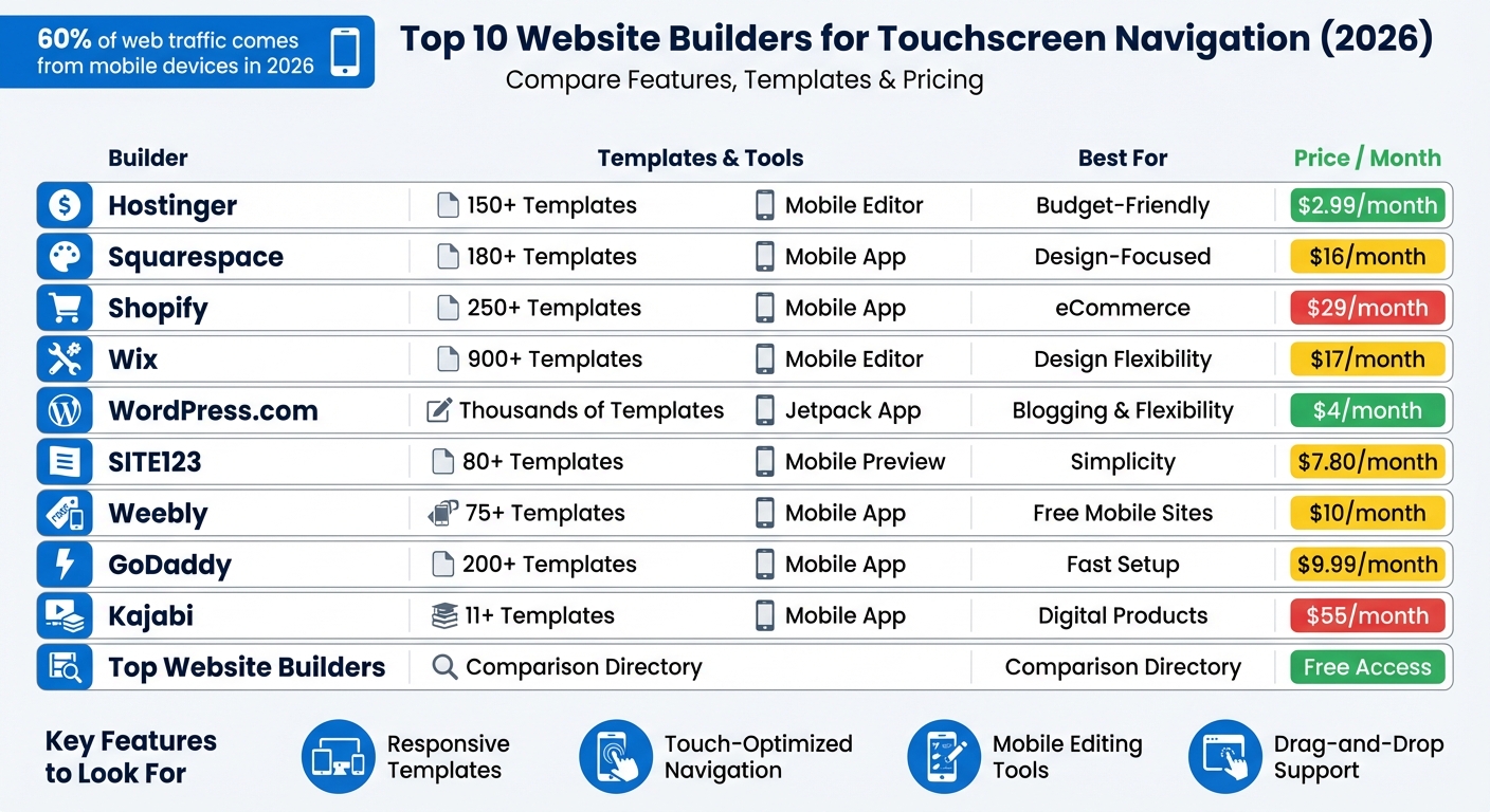
In 2026, over 60% of web traffic comes from mobile devices, meaning effective touchscreen navigation is essential for a website's success. If users struggle to interact with your site - tapping tiny buttons or zooming in to read content - they’ll leave, and search engines like Google will penalize your rankings. Modern website builders make creating mobile-friendly sites easy with features like drag-and-drop editors, responsive templates, and mobile-specific tools. Here are the top website builders that prioritize touchscreen usability:
- Hostinger: Affordable ($2.99/month), with AI tools, 150+ templates, and a mobile editor.
- Squarespace: Sleek designs, 180+ templates, and AMP for faster mobile performance.
- Shopify: Best for eCommerce, with 250+ responsive themes and mobile-first checkout.
- Wix: Offers 900+ templates, a dedicated mobile editor, and responsive AI features.
- WordPress.com: Fully responsive themes and mobile editing via the Jetpack app.
- SITE123: Simple point-and-click system with mobile previews and sticky navigation.
- Weebly: Easy drag-and-drop editor, 75+ responsive themes, and a mobile app.
- GoDaddy: Fast setup with swipe-based editing and 200+ mobile-ready templates.
- Kajabi: Tailored for digital products with mobile-specific settings and a native app.
- Top Website Builders: A directory to compare mobile-friendly platforms.
Quick Comparison:
| Website Builder | Templates | Mobile Editing Tools | Best For | Starting Price (USD) |
|---|---|---|---|---|
| Hostinger | 150+ | Mobile Editor | Budget-Friendly | $2.99/month |
| Squarespace | 180+ | Mobile App | Design-Focused | $16/month |
| Shopify | 250+ | Mobile App | eCommerce | $29/month |
| Wix | 900+ | Mobile Editor | Design Flexibility | $17/month |
| WordPress.com | Thousands | Jetpack App | Blogging & Flexibility | $4/month |
| SITE123 | 80+ | Mobile Preview | Simplicity | $7.80/month |
| Weebly | 75+ | Mobile App | Free Mobile Sites | $10/month |
| GoDaddy | 200+ | Mobile App | Fast Setup | $9.99/month |
| Kajabi | 11+ | Mobile App | Digital Products | $55/month |
Each builder has its strengths, so choose one based on your needs - whether it’s budget, design, or eCommerce features.
Top 10 Website Builders for Mobile Navigation: Features and Pricing Comparison 2026
How to Build a Responsive Website in 2026
sbb-itb-94eacf4
1. Hostinger Website Builder
Hostinger Website Builder makes website creation simple with its browser-based mobile editor, eliminating the need for app downloads. You can design, tweak, and publish websites directly from your smartphone. By March 2026, over one million users had taken advantage of its AI-powered website builders.
Here’s what makes Hostinger’s mobile features stand out:
Drag-and-Drop Support
Hostinger uses a What You See Is What You Get (WYSIWYG) interface, which allows you to move and resize elements easily with touch gestures [20, 21]. For those moments when touch precision isn’t enough on smaller screens, arrow buttons offer added control [14, 20].
Mobile Editing Tools
The mobile interface is designed to feel like a native app. Gediminas G., Communications Specialist at Hostinger, shared:
"We have revamped the user interface (UI) and improved the main and most popular controls to be more intuitive and mobile-friendly. With these updates, Hostinger Website Builder looks and feels like a smartphone app."
The editor includes a sidebar menu for dashboard settings and a quick-access action menu in the bottom corner. You can even use AI Assist to create SEO-friendly content directly from your phone.
Responsive Templates
Hostinger offers over 150 templates optimized for mobile devices. Its AI Website Builder can further tailor these templates to your specific needs, ensuring your site looks polished across all devices [19, 20].
Touch-Optimized Navigation
You have the flexibility to customize your mobile layout independently of the desktop version. Adjust the placement of elements, modify the burger menu and logo in the mobile header, or let the Auto-Fix Layout tool align everything automatically based on your desktop design [15, 17].
Pricing is competitive, starting at $2.99/month for the Premium plan, with the Business plan - featuring AI tools and eCommerce capabilities - available for $3.79/month [2, 8, 18].
2. Squarespace
Squarespace blends sleek design with practical touchscreen functionality using its Fluid Engine drag-and-drop editor. With over 180 professionally designed templates that automatically adjust to mobile screens, it's a great option for users focused on both design quality and mobile usability. Building on Hostinger's mobile-friendly features, Squarespace takes touchscreen design a step further with its innovative editor.
Drag-and-Drop Support
The Fluid Engine utilizes a flexible grid system, allowing precise placement of elements while keeping layouts responsive on mobile devices. You can rearrange, resize, and edit individual blocks in the mobile view without affecting the desktop layout, ensuring a seamless user experience across devices. The built-in Device View Tool lets you preview and test how your site looks on different screen sizes right within the editor.
"Fluid Engine, our newest drag-and-drop website editor, is the simplest way to express creativity online." - Squarespace
To enhance touchscreen usability, experts recommend a minimum tap target size of 44px to reduce accidental clicks. Squarespace also enables Accelerated Mobile Pages (AMP) by default, which creates lightweight, fast-loading versions of your site for smoother scrolling and quicker access.
Mobile Editing Tools
Squarespace provides a robust mobile app for both iOS and Android, making it easy to update content, manage SEO settings, and track analytics on the go. The app is perfect for time-sensitive tasks like replying to customer messages or launching email campaigns directly from your phone. It also includes touch-friendly features such as draggable image focal points, ensuring that key parts of your visuals remain visible on smaller screens. These tools help maintain consistent visual appeal across all devices.
Responsive Templates
All Squarespace 7.1 templates are fully responsive, using grid-based logic to adjust content for any screen size. With AI-powered builders like the Blueprint AI tool, you can generate custom designs tailored to your brand's style, layout preferences, and color scheme. Templates are optimized for mobile readability, featuring elements like collapsible navigation menus, well-spaced sections, and a minimum font size of 16px to eliminate the need for zooming.
Pricing starts at $16/month for the Personal plan (billed annually). The Business plan, at $23/month, includes advanced analytics and unlimited contributors. For eCommerce needs, plans start at $27/month for basic features, with advanced options like abandoned cart recovery available at $49/month.
3. Shopify

Shopify is recognized as a no code ecommerce website builder, offering a seamless way to create sites optimized for all devices. With over 250 responsive themes and a mobile-first approach, Shopify ensures your website performs smoothly on any screen. Its focus on mobile commerce means every tap feels responsive, delivering a polished browsing experience.
Drag-and-Drop Support
Shopify's section-based drag-and-drop editor makes designing your store straightforward. You can visually add, rearrange, and update elements like images and text blocks without needing to code. Built-in design boundaries help keep layouts organized and functional, especially on mobile screens. Plus, you can edit both desktop and mobile versions at the same time, ensuring your site is instantly touch-friendly.
"You should be able to move things around, update your homepage, whatever it is, and not have to ask for help every time. It should just make sense."
- Ben Sehl, Director of Product, Shopify
For better performance, tools like PageSpeed Insights can help pinpoint any issues slowing down your mobile loading times. Shopify also offers Sidekick, an AI-powered tool that analyzes your store data and suggests products to feature on your homepage, boosting mobile engagement. These intuitive features even extend to Shopify’s mobile app.
Mobile Editing Tools
Shopify takes mobile integration a step further with its dedicated mobile app for iOS and Android. This app includes a full theme editor and a Store Overview, consolidating all editing and publishing controls into a touch-friendly interface. With mobile devices driving 60% of ecommerce sales in the U.S., these tools let merchants make instant updates from anywhere.
"Mobile design is often overlooked by businesses. Yet, with mobile now accounting for 60% of total US ecommerce sales... delivering a seamless mobile shopping experience is no longer optional - it's a necessity."
- Kellie Kowalski, Head of UX Design, Fuel Made
To improve usability, ensure interactive elements are at least 48×48 pixels with enough white space. Features like address autocompletion can reduce manual input, and adding sticky navigation keeps menus accessible throughout the shopping experience.
Responsive Templates
Shopify themes are designed to adapt automatically to desktops, tablets, and smartphones. Options like Symmetry for storytelling, Pacific for large inventories, and Roxxe with over 70 pre-made layouts provide flexible design solutions. The Responsive Checkout adjusts to any device, making the purchasing process easy for touchscreen users. Shopify Magic, an AI tool, can also create mobile-optimized product listings and landing pages from simple prompts.
For the best results, always test your live site on actual devices instead of relying solely on preview mode. Using hamburger menus can help save screen space, and compressing high-resolution images is critical - since even a one-second delay in loading time can lead to a 7% drop in conversions.
Shopify pricing starts at $29/month for the Basic plan, with an introductory offer of three days free followed by $1/month for the first three months. The Standard plan is $79/month, and the Advanced plan is $299/month. Shopify holds a 4.4 out of 5 rating on G2, praised for its cross-device compatibility and responsive design.
4. Wix
Wix has taken mobile-friendly navigation seriously, offering tools specifically designed to optimize touchscreen experiences. With more than 900 mobile-ready templates and the knowledge that over 60% of global web traffic comes from mobile devices, Wix provides two platforms to cater to different needs: the standard Wix Editor, which uses adaptive design, and Wix Studio, which employs CSS Grid and Flexbox for fully responsive layouts. Both approaches focus on creating touch-friendly, seamless navigation.
Drag-and-Drop Support
The drag-and-drop editor on Wix gives you complete control over element placement, making it easier to design for touch navigation. For instance, you can resize buttons to the recommended 44×44 pixels for comfortable tapping and position key calls-to-action in the "thumb zone", ensuring easy one-handed use.
"Since fingers are thicker than desktop cursors, it's essential to space out links further apart on mobile sites to prevent misclicks." - Rachel Bistricer, Wix
Wix also provides a dedicated mobile editor, allowing you to fine-tune the mobile view by dragging, dropping, or hiding elements to reduce clutter. You can increase spacing between links to avoid accidental taps and even enable gesture-based features like swiping or pinching. Tools such as horizontal and vertical rulers, gridlines, and the "Snap to Objects" feature (aligning elements within 5 pixels) help ensure precision.
Mobile Editing Tools
Wix's mobile editor toolbar is packed with features to streamline the design process. Quick actions like copy, paste, duplicate, and delete make adjustments easy, while tools like "Auto Space on Drag" and the "Spacing Guide" maintain consistent spacing automatically. The "Zoom Out & Reorder" feature provides an overview of your layout, allowing you to rearrange sections through drag-and-drop or move icons. You can also hide desktop elements that don’t work well on mobile and add mobile-specific features like a Quick Action Bar, "Back to Top" buttons, and welcome screens. For on-the-go updates, the Wix mobile app for iOS and Android lets you edit text, button links, and images in real time.
Responsive Templates
Wix stands out by offering both adaptive and fully responsive options, giving users flexibility depending on their design needs. The standard editor uses an adaptive approach, creating separate desktop and mobile versions, which allows for detailed customization but may require manual adjustments. Meanwhile, Wix Studio provides fully responsive layouts that automatically adapt to any screen size using advanced CSS techniques .
"Responsiveness isn't just an afterthought in Wix Studio - it's built into the entire design and development workflow. From the first breakpoint to publishing, everything adapts perfectly." - Roy Wax, PMM, Wix Studio
For better readability on mobile, Wix suggests using body text of at least 16–18 px. Wix Studio also features "Responsive AI", which adjusts your layout with a single click, resizing elements to fit all screen widths seamlessly.
Wix pricing starts at $17/month for the Light plan, $29/month for the Core plan, and $36/month for the Business plan. For Wix Studio, plans begin at $19/month. The platform boasts a 4.1 out of 5 rating on Trustpilot from over 26,000 reviews and is often praised as the "#1 mobile site builder" for its balance of AI-driven tools and manual customization options.
5. WordPress.com
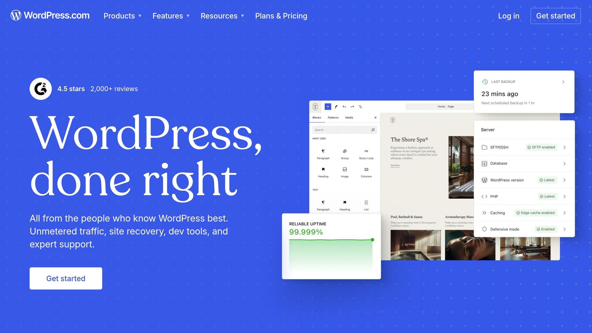
WordPress.com stands out in mobile-first design by offering touchscreen-friendly features through fully responsive themes and user-friendly editing tools. As the platform behind 43.6% of all websites online, WordPress.com ensures seamless optimization for any device - no need for separate mobile and desktop versions. Its themes automatically adjust layouts, images, and content to fit screens of all sizes.
"Every single WordPress.com theme is responsive. This means that no matter what theme you decide to use, your website will load exactly how you want it to on mobile, tablet, and desktop devices." - The WordPress.com Team
Responsive Templates
WordPress.com themes use fluid grids and CSS media queries to adapt effortlessly to different screen sizes. For instance, a desktop layout with three columns reconfigures into a single column on mobile, while horizontal navigation menus transform into collapsible hamburger menus for easier touch interaction. The platform's theme library caters to industries like real estate, health, photography, and software, all designed with touch-friendly functionality in mind.
Mobile Editing Tools
With the free Jetpack mobile app available for iOS and Android, users can create posts, edit pages, and upload photos using an interface designed for touchscreens. On desktop, WordPress.com offers preview modes for Desktop, Tablet, and Mobile, allowing users to fine-tune layouts. Features like "Stack on mobile" for columns and media blocks, as well as customizable navigation menus, ensure a polished look across devices.
For pricing, WordPress.com provides a Free plan with basic responsive themes. Paid plans start at $16.00/month for Personal, $18.00/month for Business, and $45.00/month for Commerce. Business and Commerce plans unlock additional features like custom CSS for hiding elements on mobile and access to over 50,000 plugins for enhanced touch functionality.
6. SITE123
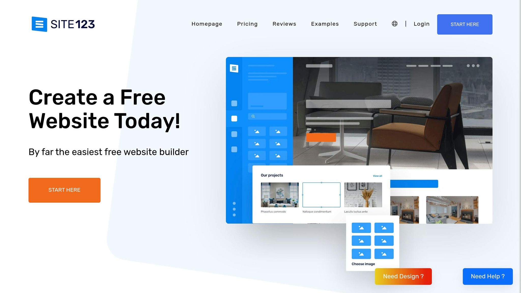
SITE123 takes a different approach from traditional drag-and-drop website builders by focusing on a point-and-click system. This method is particularly suited for touchscreen devices, ensuring ease of use. Its section-based design automatically adjusts content for various screen sizes, reducing layout issues. Plus, all 80+ templates are mobile-responsive, so any desktop changes are instantly mirrored on tablets and smartphones. Let’s dive into how SITE123’s features simplify mobile navigation.
Responsive Templates
SITE123’s point-and-click system ensures that its templates rely on a clean, single-column design for mobile screens. This eliminates problems often caused by multi-column layouts on smaller devices. The platform’s fluid grids adapt content seamlessly to any screen size, so there’s no need to create separate mobile versions. A built-in preview tool allows you to see how your site will look on desktops, tablets, and smartphones before going live. For added convenience, the template gallery includes QR codes, letting you test mobile navigation directly on your device.
Touch-Optimized Navigation
SITE123 doesn’t stop at responsive layouts - it also tailors interactive elements for touchscreens. Navigation menus are optimized for touch interactions, with customizable options for menu height and spacing. Additionally, the platform features a sticky contact button that remains fixed at the bottom of the screen during scrolling. This button’s size can be adjusted for easier tapping, enhancing user experience on touch devices.
"SITE123 has responsive layouts with navigation menus to make your page match your audience".
Mobile Editing Tools
Managing your SITE123 website is straightforward and can be done through any web browser. While the editor is primarily designed for desktop, it includes a Device Preview tool that lets you toggle between desktop, tablet, and smartphone views. You can also tweak mobile-specific settings, such as content spacing, to ensure your site looks polished on smaller screens. Pricing starts with a Free Plan offering 250 MB of storage, while the Basic Plan, which includes a custom domain, is available for $12.80/month when billed annually.
7. Weebly

Weebly’s user-friendly drag-and-drop editor and responsive templates have attracted over 30 million users globally, allowing anyone to build touchscreen-friendly websites without needing technical expertise. With over 75 professionally designed themes, Weebly ensures layouts and navigation automatically adapt to different screen sizes.
Drag-and-Drop Support
Weebly’s grid-based drag-and-drop editor makes it easy to add and rearrange elements like text, images, videos, and maps.
"Weebly puts powerful mobile website builder tools directly into your hands. Full mobile optimization and customization is simple with a visual editor that allows you to drag and drop elements into a fully responsive template." - Weebly
This approach ensures your website design adjusts seamlessly to any device.
Responsive Templates
Weebly’s themes are designed to adapt automatically for touchscreen navigation. The platform also includes a Device View tool, letting you preview how your site will look on mobile and tablet screens. This helps you avoid common issues like excessive scrolling or cramped layouts. Navigation and content elements resize and stack to maintain usability on smaller screens.
Mobile Editing Tools
Weebly’s mobile app allows you to manage your site from any touchscreen device. Whether you’re making quick updates, managing your store, or building a website from scratch, the app provides full control. Rated 4.1/5 by FounderJar, it was recognized as the "Best for Free Mobile Sites". The Free plan includes 500 MB of storage, while the Personal plan, at $10/month (billed annually), supports custom domains.
8. GoDaddy Website Builder
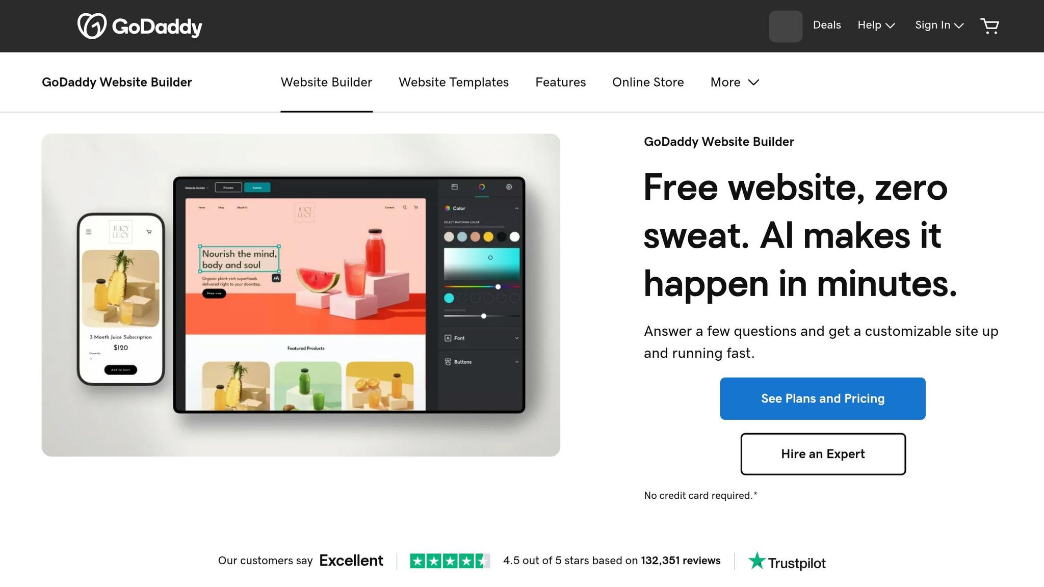
GoDaddy takes a touchscreen-first approach to website creation, offering a section-based editor that makes building mobile-friendly sites straightforward. Its horizontal content blocks stack seamlessly, ensuring layouts stay intact across different screen sizes. With an editor score of 9.2/10 and templates that are 100% mobile-responsive, GoDaddy focuses on quick and hassle-free site creation rather than pixel-level customization.
Drag-and-Drop Support
GoDaddy's design interface goes beyond traditional drag-and-drop by incorporating a swipe-based system perfect for touchscreen use. The Section Library simplifies the process by grouping elements like hero images, galleries, and contact forms, making them easy to add via a touch-friendly sidebar. You can also reorder sections effortlessly with a mobile-friendly drag-and-swipe feature.
"Instead of just dragging and dropping elements, you can swipe through designs to quickly find the one that best suits your needs." - GoDaddy Blog
This approach allows users to create a fully functional website in as little as 38 minutes, without worrying about layout issues on smaller screens. The intuitive interface also integrates well with GoDaddy's mobile editing tools.
Mobile Editing Tools
GoDaddy’s mobile app, available for both iOS and Android, provides full control over your website on the go. Whether it’s uploading images, managing store orders, tracking inventory, or replying to customer messages, everything is accessible through a unified inbox. The app also features GoDaddy Airo™, one of the AI web design generators that creates initial layouts and content, which you can tweak using simple gestures. Autosave ensures your progress is never lost.
Responsive Templates
With over 200 templates spread across 22 categories, GoDaddy ensures your site looks great on any device - be it a smartphone, tablet, or desktop. Features like hamburger menus, swipe-friendly slideshows, and streamlined layouts make navigation easy for touch users. A Mobile Preview tool helps you double-check buttons and links before publishing. Pricing starts at $9.99/month for the Basic plan (billed annually), with Premium at $14.99/month, and Commerce options at $16.99/month and $29.99/month.
9. Kajabi

Kajabi stands out as a platform tailored for creators selling online courses and digital products, offering an editing experience that prioritizes simplicity and consistency, similar to other advanced web building tools designed for modern creators. Its design ensures that every template is responsive, adapting seamlessly to mobile devices. Instead of relying on a typical drag-and-drop interface, Kajabi uses a side-menu control panel, which helps maintain uniformity across devices. With mobile devices accounting for 58.67% of global website traffic in 2023, Kajabi’s mobile-first approach aligns with how users interact with websites today.
Responsive Templates
Kajabi’s templates are built to automatically transform desktop navigation into touch-friendly dropdown menus, making them ideal for smaller screens. The platform offers 11 free themes, with premium options available starting at $297. For instance, Kim Eagle’s fitness site, Earn That Body, uses Kajabi to organize blogs, podcasts, and courses into a clean, mobile-friendly format. Similarly, Wholetones, a site focused on healing music, uses Kajabi to display an embedded video and a single, clear call-to-action for a 14-day free trial - perfect for mobile users who prefer minimal distractions.
Mobile Editing Tools
Kajabi’s editor includes a dedicated Mobile Section, allowing users to fine-tune font sizes, line spacing, and padding specifically for smaller screens without altering desktop layouts. A mobile preview mode lets you see changes in real time. You can even create separate sections for mobile and desktop, hiding intricate desktop designs and replacing them with simplified, mobile-optimized alternatives. One tip to note: Kajabi’s mobile settings default to "0" padding, so adding custom padding can help avoid a cluttered appearance.
Touch-Optimized Navigation
Kajabi ensures touch navigation is effortless by automatically sizing buttons like "Add to Cart" and "Learn More" for easy tapping, reducing the chances of accidental clicks. The platform also offers a native mobile app for iOS and Android, giving users direct access to courses and digital products through a touchscreen-friendly interface. With Google’s mobile-first indexing, this optimization can also provide an SEO boost. Kajabi’s pricing starts at $55/month for the Kickstarter plan (limited to 50 pages), with the Basic plan at $149/month, Growth at $199/month, and Pro at $399/month.
10. Top Website Builders
Top Website Builders is a directory designed to help users find and compare website builders that prioritize touchscreen-friendly, mobile-first designs. As mobile-first design becomes a must-have for modern websites, this resource simplifies the search for tools that cater to smaller screens, complementing the platforms reviewed earlier in this article.
Responsive Templates
The directory features builders offering hundreds of templates that are ready for mobile use. These templates automatically adjust layouts, images, and text to fit screens of all sizes. Navigation menus are designed to work seamlessly on smaller devices. With 52% of users likely to leave a site due to a poor mobile experience, choosing a builder with effective mobile optimization is crucial.
Touch-Optimized Navigation
Top Website Builders highlights platforms that excel in touch-friendly navigation. This includes features like hamburger menus, clearly visible links, and buttons sized for easy tapping. Every builder listed meets the recommended 44×44-pixel tap target size, minimizing accidental clicks and ensuring a smooth user experience.
Mobile Editing Tools
The directory also showcases builders equipped with mobile editing tools. These tools allow users to manage their websites directly from their smartphones or tablets. Features like responsive AI for automatic layout adjustments and options to hide desktop-only elements on mobile versions help create cleaner, faster-loading pages. These capabilities make it easier to compare platforms side by side and find the best fit for specific needs.
Feature Comparison Table
When selecting a website builder optimized for touchscreen navigation, it’s essential to weigh features like drag-and-drop functionality, mobile editing tools, responsive templates, touch-friendly navigation, and pricing. Below is a quick overview of how popular platforms stack up in these areas.
Hostinger Website Builder is the most budget-friendly option, starting at just $2.99/month. For template variety, Wix takes the lead with over 900 responsive options. Squarespace impresses with AMP support for faster mobile performance, while Shopify excels in offering a responsive checkout experience tailored specifically for mobile shoppers.
| Website Builder | Drag-and-Drop Support | Mobile Editing Tools | Responsive Templates | Touch-Optimized Navigation | Starting Price (USD) |
|---|---|---|---|---|---|
| Hostinger | Grid-based | Dedicated mobile editor | 150+ | AI-assisted layouts | $2.99/mo |
| Squarespace | Section-based | Simultaneous mobile editing | 200+ responsive | AMP support | $16.00/mo |
| Shopify | Section-based | Mobile app/editor | 230+ responsive | Optimized checkout | $19.00/mo |
| Wix | Precision control | Separate mobile editor | 900+ responsive | Advanced layout control | $17.00/mo |
| WordPress.com | Block-based | Mobile app editing | Thousands available | Theme-dependent | $4.00/mo |
| SITE123 | Limited/Section | Mobile preview/edit | Fully responsive | Auto-generated | $7.80/mo |
| Weebly | Classic drag-drop | Auto-layout adjustments | 50+ responsive | Auto-rearranging | $10.00/mo |
| GoDaddy | Section-based | AI-guided setup | Mobile-ready | Automatic optimization | $10.99/mo |
| Top Website Builders | Comprehensive directory | Comparison tools | Platform listings | Feature highlights | Free access |
Conclusion
To effectively cater to your mobile visitors, it's essential to choose a website builder designed with touchscreen navigation in mind. With more than 60% of global web traffic now coming from mobile devices, a site that’s awkward to use on smartphones and tablets can cause up to 52% of potential customers to leave. The right builder ensures responsive layouts that automatically adjust across devices, providing a smooth mobile experience.
When selecting a builder, consider your budget and design needs. For instance, Hostinger offers AI-driven mobile optimization for just $2.99/month, making it both affordable and efficient. If you’re a creative professional, Squarespace provides visually stunning templates that scale perfectly on any screen. E-commerce sellers might prefer Shopify, which excels with its mobile-friendly checkout process. Meanwhile, Wix stands out for those who value design flexibility, thanks to its dedicated mobile editor. Matching the right builder to your specific priorities is key to achieving the best results.
As discussed earlier, mobile-friendly design is not only critical for user engagement but also plays a major role in SEO, directly influencing search rankings and conversions.
Before making your final decision, test your chosen builder on actual devices. Ensure navigation feels intuitive, text is easy to read without zooming, and buttons or links are spaced appropriately for tapping. A smooth touchscreen experience not only satisfies your users but also boosts your search engine performance and enhances your brand’s credibility.
For more detailed comparisons and to find a solution tailored to your needs, visit Top Website Builders. This resource can guide you toward achieving a polished and professional mobile presence.
FAQs
What makes a website truly touch-friendly?
A website designed for touchscreens should respond effortlessly to gestures like tapping, swiping, and pinching. Key elements include larger, well-spaced buttons (typically 44–48 pixels) to make tapping easier, avoiding hover-based interactions since they don’t work well on touch devices, and offering clear visual feedback to confirm user actions. Prioritizing thumb zones - the lower third of the screen where thumbs naturally rest - makes one-handed use more comfortable. The goal is to create a layout that feels intuitive and ensures smooth navigation on any touchscreen device.
How do I test mobile navigation on real devices?
To test mobile navigation effectively, consider using cloud-based services that grant access to physical Android and iOS devices. These platforms allow you to interact directly with your app or website on real hardware, ensuring a more accurate evaluation of navigation, gestures, and overall usability. Testing on actual devices is crucial because it provides insights into performance and user experience that emulators or simulators might miss.
Which builder is best for mobile eCommerce?
Shopify stands out as a top choice for mobile eCommerce, thanks to its powerful tools and features tailored specifically for online stores. It provides an easy-to-use platform for building and managing mobile-friendly eCommerce websites, making it ideal for businesses targeting mobile shoppers.
