Want to make your website or app feel natural for American users? It’s all about getting the details right: dates like 03/11/2026, prices with the $ symbol upfront, and measurements in miles and pounds. These small changes make a big difference in user experience.
Here’s the bottom line:
- 76% of users prefer content in their native language.
- 40% will leave if a site isn’t localized.
For the U.S., this means using American English spelling (e.g., "color" not "colour") and following standards like the MM/DD/YYYY date format and the 12-hour clock. Localization also involves proper currency formatting (e.g., $1,234.56) and ensuring accessibility for all users.
Want to dive deeper? This guide covers everything you need to know, from visual design tips to using website builders for en-US localization. Let’s make your interface feel intuitive and welcoming for American audiences.
UX Localization: Design for the global audience
sbb-itb-94eacf4
Key Considerations for en-US UI Localization
When designing for American users, paying attention to the details can greatly enhance the user experience. Everything from text layout to spelling and visual content plays a role in creating an interface that feels intuitive and natural. These elements lay the foundation for effective localization in en-US settings.
Text Layout for Left-to-Right Languages
English interfaces follow a left-to-right (LTR) flow, which influences how navigation menus, form labels, and progress indicators are positioned. For example, menus typically start on the left, and input labels align to the left of fields. If you plan to add support for right-to-left (RTL) languages in the future, using advanced web building tools like CSS logical properties like margin-inline-start instead of directional ones like margin-left can make the transition smoother.
American users also favor clean and open designs with plenty of white space - quite different from the dense layouts often seen in Japan or China. Cluttered elements or fixed-width containers that break when text expands can frustrate users.
"In general, the more flexibly you can design your layout, the better. Allow text to reflow and avoid small fixed-width containers or tight squeezes where possible." - World Wide Web Consortium (W3C)
Pseudo-localization is a helpful tool during the design phase. By artificially expanding text length by about 30%, you can identify layout issues before actual translations are applied. This is especially useful since languages like German can expand by 30% to 70%, while Chinese text tends to contract by about 30%.
Now let’s dive into the linguistic details that refine en-US localization.
American English Spelling and Grammar
Even small spelling differences, like "color" versus "colour", can affect the perceived quality of localization. American English uses simplified spellings rooted in Latin, favoring endings like "-or" instead of "-our" (color), "-ize" instead of "-ise" (organize), and "-er" instead of "-re" (center). Common UI terms also follow these conventions: "canceled" is correct in U.S. English, not "cancelled", and "checkbook" replaces "chequebook."
Grammar and vocabulary also differ. Americans tend to use the simple past tense for recent actions - "I just ate" instead of "I've just eaten" - and treat collective nouns as singular: "The team is winning", not "The team are winning". Additionally, words like "apartment" (instead of "flat"), "trunk" (instead of "boot"), and "vacation" (instead of "holidays") are more familiar to U.S. users.
Clear, straightforward language is key. Avoid regional slang or overly complex phrasing that could confuse users.
The next step is ensuring the visual and textual content resonates with American users.
Visual and Textual Content for U.S. Audiences
American users value individualism and personal choice in design. Interfaces should highlight personal benefits, customization, and individual success. For example, button text like "Start my free trial" aligns with this preference.
Cultural context matters for visual elements, too. A "thumbs-up" icon is positive in the U.S. but may carry negative connotations in parts of West Africa or the Middle East.
U.S. users also appreciate informal layouts that provide clear access to information and multiple options. This reflects the cultural preference for low power distance, where transparency and equality are valued. Examples include clear pricing, privacy assurances, and easy-to-navigate menus. Video content is particularly engaging - 96% of U.S. internet users aged 18 to 24 accessed YouTube in 2018, highlighting the importance of video integration. When it comes to payment options, prioritize credit cards and PayPal, as 29.5% of U.S. citizens preferred these for online purchases in 2017.
"In individualistic cultures like the United States, users may prefer websites that focus on personal choice, customization, and individual benefits." - Devoq Design
Formatting Standards for en-US Interfaces
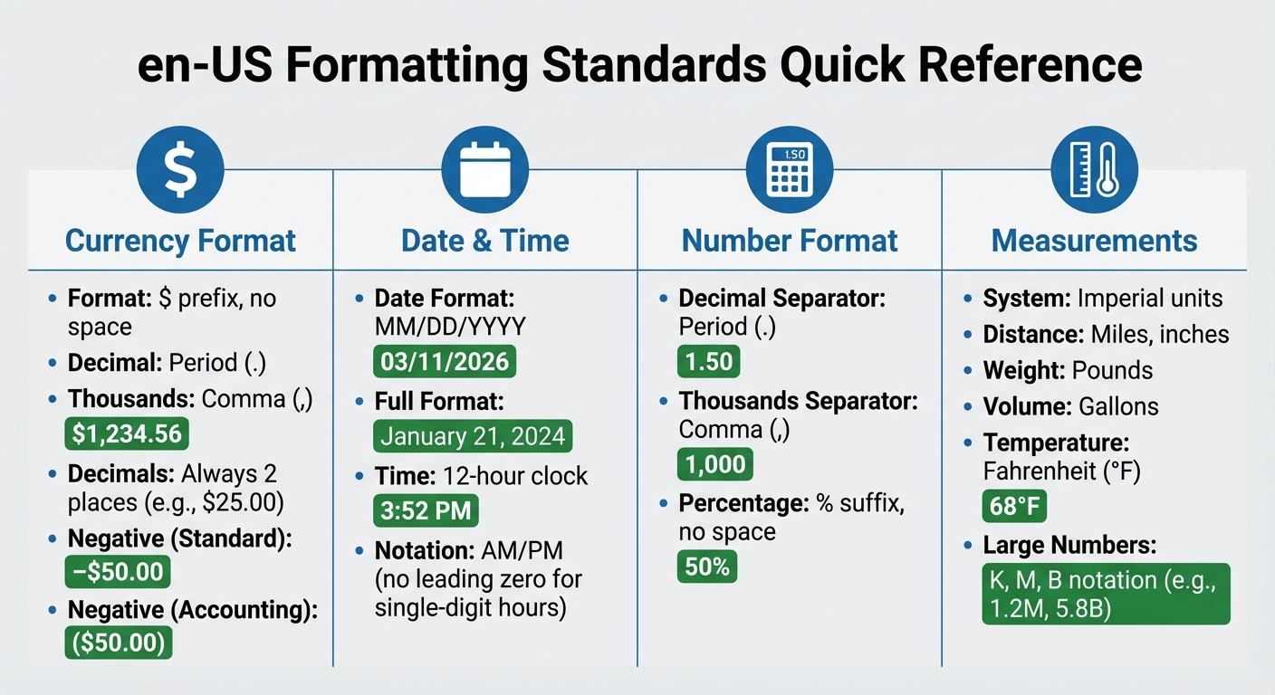
en-US Localization Formatting Standards: Currency, Dates, Numbers and Measurements
When designing interfaces for en-US audiences, precise formatting plays a key role in creating a polished and intuitive experience. Attention to details like currency, date, and number formatting ensures users feel at home with the interface.
Currency Format: Dollar Symbol and Commas
In the U.S., the dollar symbol ($) is placed directly before the amount, with a period for decimals and a comma to separate thousands (e.g., $1,234.56). Always show two decimal places for consistency, even if the amount is a whole number (e.g., $25.00, not $25).
For negative amounts, either use a minus sign (e.g., –$50.00) or parentheses in accounting contexts (e.g., ($50.00)). If international clarity is needed, add the ISO code (e.g., US$1,500).
To ensure consistency across platforms, use essential tools for website creation like Intl.NumberFormat with the en-US locale.
Date and Time: MM/DD/YYYY and 12-Hour Clock
In the U.S., dates follow the month–day–year order. For example, March 11, 2026, is written as 03/11/2026 in numeric form. When writing out dates in full, include a comma before the year (e.g., January 21, 2024).
"In traditional American usage, dates are written in the month–day–year order (e.g., March 11, 2026) with a comma before and after the year if it is not at the end of a sentence, and time is written in 12-hour notation (e.g., 1:08 am)." – Wikipedia
Time is expressed using the 12-hour clock with AM or PM to indicate morning or evening (e.g., 3:52 PM). Single-digit hours do not include a leading zero. For clarity, use explicit labels like 12:00 noon or 12:00 midnight instead of just "12:00." When working across time zones, include the time zone abbreviation (e.g., EST, PST, or UTC) to avoid confusion.
Number Format: Decimal Period and Thousands Comma
Numbers in the U.S. use a period for decimals and a comma to separate thousands (e.g., 1,000.50). This applies across all numeric displays, from financial data to form inputs. For percentages, place the percent sign immediately after the number with no space (e.g., 50%, not 50 %).
| Feature | en-US Format | Example |
|---|---|---|
| Decimal Separator | Period (.) | 1.50 |
| Thousands Separator | Comma (,) | 1,000 |
| Currency | $ prefix, no space | $100.00 |
| Negative (Standard) | Minus before symbol | –$50.00 |
| Negative (Accounting) | Parentheses | ($50.00) |
| Percentage | % suffix, no space | 50% |
Measurement and Temperature Units
For measurements, use imperial units like miles, pounds, inches, and gallons. Temperatures should be displayed in Fahrenheit (°F). If converting from metric, ensure accuracy (e.g., 20°C becomes 68°F).
To simplify large numbers in dashboards or analytics, use compact notations such as K for thousands, M for millions, and B for billions (e.g., 1.2M, 5.8B). This keeps the interface clean and easy to interpret.
Design Principles for Localization
Creating a user interface tailored to en-US audiences involves more than just adjusting date formats or currency symbols. While formatting is essential, the design must also align with American user habits and expectations. A well-thought-out interface should handle content variations seamlessly while staying accessible and appropriate for U.S. users.
Flexible Grids and Responsive Typography
Text length can vary depending on context. For example, a button labeled "Submit" might need to expand to "Submit Application" or "Submit Payment Information" in different scenarios. Fixed-width containers often fail to accommodate these changes, leading to clipped or awkwardly wrapped text.
To address this, use auto-resizing components with min-width and padding. Replace fixed pixel dimensions and directional CSS properties with logical, adaptable ones. The U.S. Web Design System (USWDS) employs a 12-column flexbox-based grid, enabling UI elements to reflow naturally with content changes. This ensures that navigation menus, form buttons, and card layouts adjust smoothly across devices, from smartphones to widescreen monitors.
For typography, dynamic scaling is key. Use CSS clamp() to adjust font sizes based on the viewport width. On U.S. government websites, the standard minimum font size for body text is 16px, with ideal line lengths between 45 and 90 characters (66 is optimal for long-form content). To maintain readability, apply a unitless line-height multiplier of 1.5 for body text and 1.0 to 1.3 for headings.
Responsive design is just one part of the equation. Accessibility is equally critical, especially for U.S. audiences.
Accessibility Standards and WCAG Compliance

In the U.S., accessibility is non-negotiable. Federal websites must comply with the Revised 508 Standards, which align with WCAG guidelines. Accessibility tools benefit a wide range of users - research shows they ease navigation for 57% of all computer users, not just those with disabilities.
Start by declaring the page language with <html lang="en"> to ensure proper screen reader pronunciation. For foreign phrases like "café" or "résumé", wrap them in a <span lang="fr"> tag.
Color contrast is another priority. Regular text requires a 4.5:1 contrast ratio, while larger text needs at least 3:1. Tools like the WebAIM color contrast checker can help verify compliance. Avoid relying solely on color to convey meaning - add underlines to links or include icons in error messages.
"Following these guidelines will make content more accessible to a wider range of people with disabilities... [and] will also often make web content more usable to users in general." – W3C
Keyboard accessibility is equally crucial. All functionality must work via keyboard, with the tab order following the visual flow (left to right, top to bottom). Ensure focus indicators are clearly visible. Use native HTML elements like <button> and <a> whenever possible, as they come with built-in keyboard and screen reader support.
Finally, thoughtful iconography enhances communication and ensures cultural alignment.
Iconography and Imagery for U.S. Audiences
Icons often carry cultural significance. In the U.S., a checkmark (✔️) symbolizes approval or correctness, while an X indicates an error or cancellation. For e-commerce, the shopping cart icon is standard, although some international sites may use a basket instead.
Stick to familiar U.S. color associations - red for errors, green for success, and yellow for warnings - to align with user expectations.
Avoid embedding text in images. Instead, use CSS to overlay text, ensuring it remains accessible and easy to update. When selecting imagery, choose photos and illustrations that reflect the diversity of U.S. audiences and align with American norms.
For language selectors, display native language names like "Español" instead of "Spanish." Avoid using flags to represent languages, as they can be ambiguous or politically sensitive.
Using Website Builders for en-US Localization
Website builders have grown into powerful tools with built-in features that make adapting websites for U.S. audiences much easier.
Benefits of Website Builders for Localization
Using the right website builder can save you both time and money when creating a U.S.-specific version of your site. Platforms like Webflow and Builder.io let you manage localization visually, so you can switch between the main version of your site and the en-US version to preview and edit changes in real time. This means you can make adjustments without duplicating pages or managing separate codebases.
Field-level overrides are particularly helpful. They let you tweak specific elements - like text, buttons, or links - without altering the entire layout. For example, words like "colour" or "optimise" can be changed to "color" and "optimize" for the U.S. audience without disrupting the design.
Modern website builders also allow for asset localization. You can swap out images, videos, or graphics that contain text or culturally specific elements, ensuring they resonate with U.S. users. Even the alt text can be updated to maintain accessibility standards.
The benefits are clear. LeGrand Woolley, Marketing Operations at Moloco, shared:
"Localization allows us to ship localized sites 4X faster, save on dev costs, and create custom experiences that will significantly boost engagement in our target markets."
Jason Tinnin, Founder of FlowPros, added:
"Localization is an absolute game changer. We were able to expand an enterprise client's global footprint by localizing 40 mission-critical webpages in the blink of an eye."
Beyond speed, website builders often include tools for localized SEO. These tools support en-US–specific subdirectories (like "/en-us"), localized meta titles and descriptions, and hreflang tags, ensuring search engines deliver the right version to U.S. users. Some platforms even offer automatic routing based on browser language, seamlessly directing visitors to the appropriate site version.
Formatting adjustments are another key feature. Builders typically include options to adapt date formats (MM/DD/YYYY), time displays (12-hour clock with AM/PM), and currency (USD with the "$" symbol). Some platforms can even detect a user’s system settings and adjust these elements automatically.
Component variants add flexibility by letting you create unique versions of UI elements - like buttons or forms - that only appear for U.S. users. This is especially useful for U.S.-specific promotions, compliance notices, or calls to action tied to American holidays.
Research underscores the importance of localization. A study found that 76% of consumers prefer to shop in their native language. For U.S. audiences, this means delivering content in American English with familiar formatting and references.
If you're unsure where to start, platforms like Top Website Builders offer directories to compare features and find a builder suited to your en-US localization needs.
Step-by-Step Guide for en-US Localization
To create a localized en-US site using a website builder, follow these steps:
- Add the en-US Locale: Start by adding "English (United States)" as a target locale in your builder’s settings. This ensures the platform recognizes en-US as a specific version of your site. Set a default locale for users whose regional settings can’t be detected.
- Switch to Locale View: Use the locale view to see how the en-US version will look. With on-canvas or inline editing tools, adapt text to American English. For example, change "favourite" to "favorite" and "organisation" to "organization."
- Update Formatting: Adjust date formats to MM/DD/YYYY and currency to USD with the "$" symbol. These changes ensure consistency with U.S. standards.
- Localize Assets: Replace images or graphics containing text or symbols that might not resonate with U.S. audiences. Don’t forget to update alt text for accessibility and SEO.
- Optimize for SEO: Use a clear subdirectory structure like "example.com/en-us" to maintain domain authority while targeting the U.S. Update meta titles, descriptions, and headings with American English and region-specific keywords. Hreflang tags help search engines direct users to the right version.
- Customize UI Elements: Apply per-locale style overrides to adjust font sizes, spacing, or alignment for U.S. users. Use visibility settings to show or hide sections for en-US audiences, such as U.S.-specific promotions or compliance notices.
- Test Thoroughly: Preview the en-US version on different devices and browsers to ensure everything displays correctly.
| Localization Step | Action Item for en-US | Builder Tool/Feature |
|---|---|---|
| Setup | Add "English (United States)" as a target locale | Locale Manager / Settings |
| Content | Adapt text to American English | On-canvas Editor / Inline Editing |
| Formatting | Configure date (MM/DD/YYYY) and currency (USD with "$") | Localization Settings |
| Assets | Upload U.S.-specific images and alt text | Assets Panel |
| SEO | Use "/en-us" subdirectory and update meta tags | SEO Tools / hreflang Tags |
| Testing | Verify consistency across devices | Preview Mode |
Some advanced website builders even integrate with Translation Management Systems (TMS) via APIs. This allows professional linguists to refine translations while keeping your site’s structure intact.
Keep in mind that features like Webflow’s localization tools might require an add-on plan, while Builder.io often includes advanced options in Pro plans. Check pricing to ensure the features you need are available.
Conclusion
Creating a seamless en-US localization goes far beyond simply swapping words or adjusting date formats. It’s about nailing the details - like using MM/DD/YYYY for dates and placing the dollar sign before amounts - to build trust and eliminate distractions that could frustrate users. As the W3C emphasizes, "A seemingly innocuous error can lead to misunderstanding or mistakes". Something as simple as the wrong date format can confuse users and disrupt their experience.
By sticking to American conventions - such as spelling variations and imperial measurement units - you not only make your content more relatable but also reduce barriers for your audience. Studies reveal that 40% of consumers avoid sites not tailored to their native language. For U.S. users, this means delivering content in American English with familiar cultural norms. As Kinga Pomykała from SimpleLocalize explains: "When localization is done well, it doesn't feel like translation, it feels like home". This sense of familiarity fosters trust and encourages engagement.
Modern website builders make en-US localization easier than ever. With tools like visual editors, automated formatting, and element-specific adjustments, these platforms handle the technical heavy lifting - such as hreflang tags and locale-specific URLs - while you focus on creating content that resonates. If you're looking to grow your U.S. presence or refine your localized site, check out Top Website Builders to find tools tailored to your needs. Combining cultural awareness with the power of modern technology ensures your site feels intuitive and reliable to American users.
FAQs
What should I localize first for en-US users?
To make your interface user-friendly for en-US users, begin by using MM/DD/YYYY for dates and the 12-hour clock format with AM/PM for time. This is the standard in the United States and helps avoid confusion.
Next, adjust number formats to use a period for decimal points and a comma for thousand separators. For example, write "1,000.50" instead of "1.000,50".
When it comes to money, always place the dollar sign ($) before the amount, like "$25.99". This aligns with U.S. currency conventions.
Finally, use imperial units for measurements, such as inches, feet, pounds, and Fahrenheit for temperature. These small but crucial changes make the interface feel intuitive and natural for users in the U.S.
How do I prevent layout breaks when text changes?
When localizing a user interface, it's crucial to design with flexibility in mind to handle variations in text length. Responsive design and dynamic sizing can ensure that elements adjust smoothly, preventing layout issues. Externalizing strings is another key step, making it easier to manage translations without hardcoding text.
Additionally, account for different writing directions, such as right-to-left (RTL) layouts for languages like Arabic or Hebrew. Testing with real translations and involving native speakers can help identify problems like text overflow or misaligned elements early in the process. These steps ensure your UI remains functional and visually consistent across all languages.
Which U.S. accessibility rules should my UI follow?
Your user interface (UI) must adhere to the Web Content Accessibility Guidelines (WCAG) and the Revised 508 Standards. These frameworks are designed to make digital content accessible to everyone, including individuals with disabilities. By following these guidelines, you ensure that your interface is usable for a diverse audience, promoting inclusivity and equal access.