Keyboard accessibility is a must for making websites usable for everyone, including individuals with disabilities or those who prefer keyboard navigation. It ensures all features - like links, buttons, and forms - can be accessed without a mouse. Following these practices not only aligns with WCAG standards but also improves usability for all users.
Key Takeaways:
- Focus Indicators: Always show which element is active during navigation. Use high-contrast outlines or styles to make them visible.
- Keyboard-Friendly Elements: Stick to native HTML tags like
<button>and<input>. For custom components, manage focus withtabindexand keyboard event handlers. - Logical Tab Order: Ensure the navigation order follows the visual layout. Avoid disrupting it with positive
tabindexvalues. - Skip Links: Add "Skip to main content" links to let users bypass repetitive navigation.
- Prevent Keyboard Traps: Users should always be able to move focus away from interactive elements, like modals or widgets, using the keyboard.
- Test Thoroughly: Navigate your site using only the keyboard to ensure every feature works as intended.
Keyboard accessibility isn't just about compliance - it's about creating a better experience for everyone. By implementing these strategies, you make your website easier to use for millions of people.
Use Clear Focus Indicators
Why Focus Indicators Are Needed
Focus indicators serve as a visual guide for keyboard users, showing which element is currently active. As accessibility consultant Sara Soueidan explains:
"The focus indicator is to keyboard users what the mouse cursor is to mouse users".
These visual cues - like outlines, borders, or background highlights - are essential for users navigating with a keyboard. Without clear focus indicators, a website becomes nearly impossible to use for keyboard navigation. This creates a major accessibility issue, especially considering that around 1 in 4 adults in the U.S. live with a disability, many of whom depend on keyboard navigation due to motor or visual impairments.
The Web Content Accessibility Guidelines (WCAG) emphasize the importance of focus indicators:
- Success Criterion 2.4.7 (Focus Visible) requires visible focus indicators for keyboard-operable interfaces.
- Success Criterion 1.4.11 (Non-text Contrast) ensures that focus indicators maintain a minimum contrast ratio of 3:1 against adjacent colors.
- WCAG 2.2 introduces Success Criterion 2.4.11 (Focus Appearance), which specifies that focus indicators should cover an area equivalent to a 2px thick perimeter around the element.
With these standards in mind, it’s clear that visible focus indicators are not just helpful - they’re essential. The next step is ensuring they’re styled effectively.
How to Style Focus Indicators
Avoid removing default browser focus indicators (e.g., using outline: none or outline: 0) unless you replace them with an accessible alternative. As Aparna Pasi, Vice President of Services at Deque, advises:
"If you decide to get rid of the browser default outlines, make sure to replace them with something else! There's a whole subset of users who rely on these outlines to tell them where they are on the page".
For better control and aesthetics, use the :focus-visible pseudo-class. This ensures focus indicators appear only during keyboard navigation, avoiding unnecessary distractions for mouse users.
Here are some practical tips for styling focus indicators:
- Use a 2px–3px solid, high-contrast outline with a 2px–4px
outline-offsetto create spacing between the indicator and the element. For example, Deque's Cauldron Pattern Library uses a2px solid #d71ef7outline with a 2px offset, ensuring visibility on light backgrounds like white or off-white. - If your website has mixed background colors, consider a two-color indicator - a white dashed line over a black solid line - to ensure visibility on both light and dark surfaces.
- Combine CSS properties like
outlineandbox-shadowto create a "halo" effect. This approach enhances focus visibility while meeting the required 3:1 contrast ratio.
sbb-itb-94eacf4
Web Accessibility Tutorial (A11y) - Keyboard Navigation, Aria Tags, Contrast, Semantics and more!
Make All Interactive Elements Keyboard Accessible
Every button, link, form field, and menu on your website should work seamlessly with a keyboard. The W3C Web Accessibility Initiative sums it up perfectly:
"For a web page to be accessible, all interactive elements must be operable via the keyboard."
Stick to native HTML elements like <a>, <button>, and <input> whenever possible. If you’re building custom interactive components, use tabindex="0" to include them in the natural tab order. For elements that should only receive focus programmatically, like error messages or hidden menu items, use tabindex="-1".
Ensure that anything clickable with a mouse also works with a keyboard. Custom buttons, for instance, should respond to both Enter and Spacebar. MDN Contributors explain:
"If an element can be clicked with a pointing device, such as a mouse, then it should also be focusable using the keyboard."
For more complex widgets like menus or tab lists, manage focus using techniques like the "roving tabindex" (moving tabindex="0" to the active item) or aria-activedescendant for virtual focus. If arrow keys are used for navigation, prevent the browser from scrolling the page by calling event.preventDefault().
How to Test Keyboard Accessibility
Once you’ve implemented these principles, thorough testing ensures your site is fully accessible via keyboard.
Put your mouse aside and navigate through your site using only the keyboard. Use Tab to move forward and Shift + Tab to move backward, making sure every link, button, and form field is reachable.
As you navigate, check for a clear visual focus indicator on each element. Test that links activate with Enter, buttons respond to Enter and/or Spacebar, and checkboxes toggle with Spacebar. For custom widgets, confirm that arrow keys work correctly for internal navigation.
Roughly 25% of all digital accessibility issues are tied to insufficient keyboard support, making manual testing a must. While tools like Lighthouse or aXe can flag missing attributes, they can’t tell you if navigation feels intuitive or if all functionality works as intended.
Once testing confirms everything is functional, review common mistakes that can disrupt keyboard navigation.
Common Mistakes to Avoid
Even with proper event handlers and native elements, certain errors can still hinder keyboard accessibility.
-
Avoid using non-semantic elements for interactive features. For example, creating buttons with
<div>or<span>tags without adding keyboard event handlers ortabindex="0"makes them inaccessible. Similarly,<a>tags without anhrefattribute aren’t focusable by default. -
Don’t rely solely on mouse events. A custom button with only an
onclickhandler won’t work for keyboard users. Make sure both Enter and Spacebar trigger the desired action. -
Never use positive
tabindexvalues liketabindex="1". These disrupt the natural tab order, causing confusion for users. The W3C advises against this practice, stating:"Authors are strongly advised NOT to use [positive tabindex] values. The element is placed in the tab sequence based on the value of tabindex... creating confusion for keyboard-only users."
-
Don’t add
tabindex="0"to static content. Making paragraphs or headings focusable forces users to tab through non-interactive elements, wasting their time and effort.
Add Skip Navigation Links
Skip navigation links are an essential tool for improving keyboard navigation, allowing users to bypass repetitive content and get straight to the main part of a page.
Without a skip link, navigating a complex page can be tedious. For example, a keyboard user might need to press Tab around 40 times just to reach the first piece of content. Similarly, screen reader users may have to endure listening to over 200 words of repetitive header and navigation elements before accessing the main content.
Skip navigation links solve this problem by giving users a shortcut to the main content, bypassing elements like headers, menus, and ads. The W3C explains:
"The intent of this success criterion is to allow people who navigate sequentially through content more direct access to the primary content of the web page."
These links are particularly helpful for users with limited arm mobility - such as those using switches, mouth sticks, or head pointers - by reducing the physical effort required to navigate through multiple keystrokes.
Skip links also help meet the WCAG 2.4.1 (Bypass Blocks) requirement. While ARIA landmarks like <main> and <nav> can assist screen reader users, skip links are often preferred by keyboard users since most browsers don’t natively support jumping between landmarks without additional tools. By incorporating skip links, you create a more accessible and user-friendly experience.
How to Implement Skip Links
To add a skip link effectively, follow these steps:
- Place the skip link as the first focusable element after the
<body>tag. Itshrefattribute should point to theidof the main content container, such as<a href="#main">linking to<main id="main">. - Use clear, descriptive text like "Skip to main content" instead of generic terms like "Skip navigation."
- Hide the skip link off-screen using CSS (e.g.,
position: absolute; left: -10,000px;) and ensure it becomes visible when focused by repositioning it (e.g.,position: static;). Avoid usingdisplay: noneorvisibility: hidden, as these remove the link from the keyboard tab order. - Style the link with a high-contrast focus indicator to make it noticeable when active. As WebAIM points out:
"A very small or hidden link does not benefit the audience that most needs skip links - sighted keyboard users."
Maintain Logical Tab Order
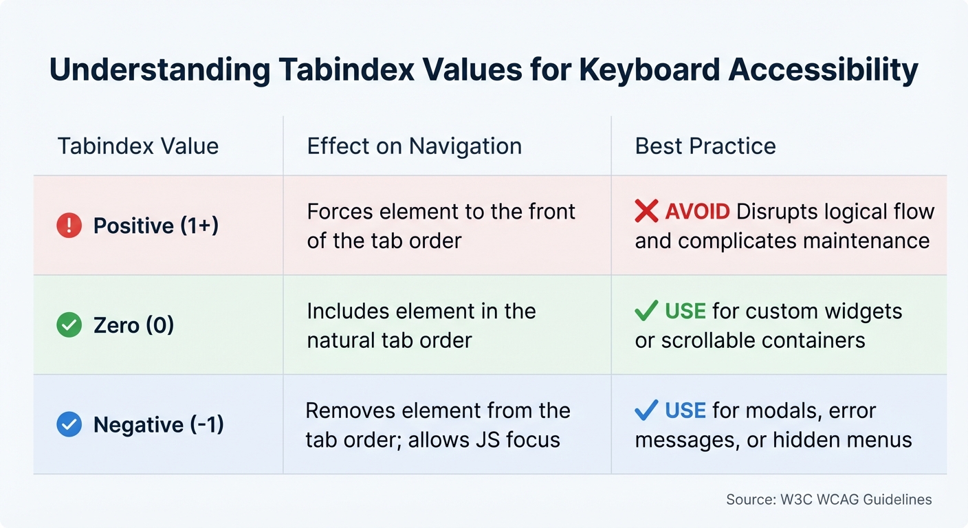
Tabindex Values Guide for Keyboard Accessibility
Logical tab order ensures keyboard users can navigate content in a natural and predictable way. When the order is inconsistent, it can confuse users and make the experience less accessible.
The W3C emphasizes this principle:
"The intent of this success criterion is to ensure that when users navigate sequentially through content, they encounter information in an order that is consistent with the meaning of the content and can be operated from the keyboard." – W3C
For sighted keyboard users, the visual layout helps them anticipate where the focus will move next. If pressing Tab unexpectedly jumps from the top navigation to the footer and then back to the sidebar, it disrupts the flow. Similarly, users relying on screen magnifiers, who can only view a small portion of the screen at a time, might misinterpret the content if the tab order is erratic.
By default, the tab order follows the HTML source (or DOM) structure. If this order doesn't align with the visual arrangement of elements, navigation will feel disjointed - even if the design looks polished. Creating a logical structure in the source code is essential for using semantic HTML and managing tabindex effectively.
Using Semantic HTML Elements
Semantic HTML naturally establishes a logical tab order. Elements like <button>, <a>, <input>, and <select> are inherently focusable, so browsers include them in the tab order without additional coding.
The key is to align the order of HTML elements with their visual placement on the page. WebAIM advises:
"Structure your underlying source code so that the reading/navigation order is correct. Then, if necessary, use CSS to control the visual presentation of the elements on your page." – WebAIM
Avoid using CSS properties like float, flex-direction: reverse, or absolute positioning if they cause the tab order to differ from the visual layout. For interactive elements that are hidden (like a collapsed mobile menu), use display: none or visibility: hidden to prevent users from tabbing into invisible content.
Using the tabindex Attribute
When semantic HTML alone isn't enough, the tabindex attribute can help refine the focus order. However, it must be used carefully. Positive tabindex values should generally be avoided, as they override the natural DOM order and can complicate maintenance. As Caitlin de Rooij, a Web Accessibility Specialist, explains:
"The use of positive tabindex values is generally discouraged. This practice can create a navigation order that contradicts the visual layout of the page or the expected order for screen reader users, leading to confusion and a disjointed user experience." – Caitlin de Rooij
Instead, use tabindex="0" to include non-native elements (like a <div> used as a custom button) in the natural tab order. This value is also helpful for scrollable containers (using CSS overflow: auto or scroll), allowing users to focus and navigate through the content. Remember to add keyboard event handlers for Enter and Spacebar on custom elements with tabindex="0".
For elements that shouldn't be accessible via the Tab key but still need programmatic focus (e.g., modal dialogs, error messages, or hidden menus), use tabindex="-1".
| Tabindex Value | Effect on Navigation | Best Practice |
|---|---|---|
| Positive (1+) | Forces element to the front of the tab order | Avoid - disrupts logical flow and complicates maintenance. |
| Zero (0) | Includes element in the natural tab order | Use for custom widgets or scrollable containers. |
| Negative (-1) | Removes element from the tab order; allows JS focus | Use for modals, error messages, or hidden menus. |
Use ARIA for Custom Widgets and Controls
ARIA is essential when native HTML elements can't fulfill your accessibility needs. It allows you to define roles and properties for elements, helping assistive technologies like screen readers understand their purpose. However, ARIA doesn't alter an element's appearance or behavior - it simply updates the accessibility tree that these tools rely on.
One key limitation of ARIA is the lack of built-in keyboard support. According to the W3C ARIA Authoring Practices Guide:
"Unlike native HTML form elements, browsers do not provide keyboard support for graphical user interface (GUI) components that are made accessible with ARIA; authors have to provide the keyboard support in their code."
This means you'll need to manually code all keyboard interactions, such as using arrow keys, Enter, or the Spacebar. Using top website building tools that prioritize native HTML elements is preferable when possible, as they come with built-in keyboard functionality and better compatibility. As MDN Contributors wisely note:
"No ARIA is better than bad ARIA." - MDN Contributors
When ARIA is unavoidable, stick to the W3C ARIA Authoring Practices Guide (APG) for implementing standard keyboard behaviors. For composite widgets like menus or grids, you can use one of two focus management techniques:
- Roving tabindex: Set
tabindex="0"on the active element andtabindex="-1"on others. - aria-activedescendant: Keep the container element focused while using this attribute to indicate which child element is active.
Additionally, ensure the visual focus indicator is distinct from the "selected" state to prevent confusion. These principles lay the groundwork for applying ARIA roles effectively.
ARIA Roles for Custom Components
ARIA roles help assistive technologies identify and interact with elements. Here’s a breakdown of the main types:
- Widget roles: These include roles like
button,checkbox, andslider, which define standalone interactive elements. - Composite roles: Roles like
menu,tablist, andgriddescribe containers managing multiple focusable children, often navigated using arrow keys. - Window roles: Roles such as
dialogandalertdialogidentify sub-windows that typically trap keyboard focus until closed. - Live region roles: Roles like
alertandstatusnotify assistive technologies about dynamic content updates without shifting the user's focus.
For example, to make a search form more accessible, you can assign role="search" to a <form> element or wrap it in a <search> element. Adding aria-label="Search through site content" to the input field provides a helpful description for screen readers without altering the visual design.
Testing ARIA Implementations
Testing ARIA isn't just about reviewing your code - it’s about ensuring assistive technologies interpret it correctly. Use screen readers like NVDA, JAWS, or VoiceOver to verify that roles and states are announced properly, such as "button" or "checked".
Leverage tools like Chrome DevTools' accessibility pane to inspect the accessibility tree and confirm that roles and attributes are accurately exposed. Also, check that document.activeElement doesn’t default to the body element after interactions like closing a dialog or deleting an item - this indicates a focus issue. For composite widgets, ensure that the Tab key moves focus between components and arrow keys navigate within them. If you're using aria-activedescendant, confirm that the container keeps DOM focus while the screen reader identifies the active child element.
It’s worth noting that WebAim's survey of over one million home pages revealed that pages with ARIA averaged 41% more detected errors than those without it. This highlights the importance of thorough testing and sticking to established ARIA practices instead of creating custom implementations. Proper testing can make all the difference in delivering an accessible experience.
Prevent Keyboard Traps
When designing accessible websites, ensuring smooth navigation for keyboard users is essential. One critical aspect of this is preventing keyboard traps - situations where users can navigate into an interactive element but can't move focus away using standard controls like Tab or Shift+Tab. These traps don't just inconvenience users; they can completely block progress, forcing a page refresh and potentially causing data loss. For individuals with motor impairments, blindness, or other disabilities, keyboard traps can make a website entirely unusable.
The Web Content Accessibility Guidelines (WCAG) address this issue directly:
"If keyboard focus can be moved to a component of the page using a keyboard interface, then focus can be moved away from that component using only a keyboard interface, and, if it requires more than unmodified arrow or tab keys or other standard exit methods, the user is advised of the method for moving focus away." (WCAG 2.1)
This is a Level A requirement, underscoring its importance for basic web accessibility. Yet, the 2024 WebAIM Screen Reader User Survey reveals that lack of keyboard accessibility remains a persistent challenge, with keyboard traps affecting approximately 12% of websites. Alarmingly, 89% of keyboard-only users encounter these traps at least once a month, and 67% abandon a site immediately upon hitting one. Addressing these issues is key to creating a logical, user-friendly tab order that supports accessible design.
Finding and Fixing Keyboard Traps
The best way to uncover keyboard traps is through manual testing. Start at the browser's address bar and use the Tab key to move forward and Shift+Tab to move backward through every interactive element on the page. If focus gets stuck anywhere, you've found a trap.
Some common trouble spots include:
- Modal dialogs: These often fail to handle the Escape key properly.
- Custom widgets: Elements like date pickers and dropdowns are frequent offenders.
- Embedded media players: Video players and iframes can disrupt navigation.
- Third-party content: Ads and social media widgets can also introduce traps.
Modal dialogs alone are responsible for 34% of keyboard trap incidents. For example, the General Services Administration documented a "Forever Loop" trap where users were endlessly cycled through a set of links, unable to navigate elsewhere on the page.
To fix these issues, stick to native HTML elements such as <button>, <a>, and <input>, which come with built-in keyboard support. Avoid using positive tabindex values (1 or higher), as these can disrupt the natural focus order and create navigation loops. Once changes are made, test thoroughly to confirm the fixes work as intended.
Testing Operability in Different States
Keyboard navigation must be tested under different conditions to ensure functionality across all scenarios. For instance, form validation errors can trap focus, preventing users from moving between fields. These validation loops account for 16% of keyboard trap incidents.
When testing modals, ensure that focus remains within the modal and that both the Close button and Escape key allow users to exit, returning focus to the element that triggered the modal. For embedded content, pressing Tab should eventually move focus to the next element; these components cause 28% of trap incidents. If non-standard keys are required to exit an element, provide clear, on-screen instructions before interaction begins.
The impact of keyboard traps is significant - encountering one can increase task completion time by an average of 2.3 minutes. By addressing these challenges, you can create a smoother, more inclusive experience for all users.
Conclusion
Keyboard accessibility is a key element every website must prioritize. Whether users rely on a keyboard due to motor disabilities, use a screen reader, or simply prefer navigating with shortcuts, your site should function seamlessly without the need for a mouse.
This article has outlined several critical practices: visible focus indicators, logical tab order, skip navigation links, semantic HTML, using ARIA for custom widgets, and avoiding keyboard traps. These aren't just technical details - they determine whether users can successfully interact with your site or leave out of frustration. As WebAIM puts it, "Keyboard accessibility is one of the most important aspects of web accessibility". The real test of these principles comes through hands-on testing.
Take a moment to put these strategies into action. Ditch the mouse and try navigating your site using only the keyboard - Tab, Shift+Tab, Enter, Spacebar, and arrow keys. Ensure all interactive elements have visible focus, that navigation flows logically, and that users can exit modals or custom controls without getting stuck. This type of manual testing often uncovers issues that automated tools overlook.
Keyboard accessibility benefits a wide range of users, from individuals with Parkinson's disease or paralysis to those who prefer efficient navigation or use external keyboards on mobile devices. The W3C underscores this point:
"The objective... is to provide keyboard operation for all the functionality of the page. When all functionality of content can be operated through a keyboard... it can be operated by those with no vision as well as by those who must use alternate keyboards".
Start applying these practices today. Leverage native HTML elements, avoid positive tabindex values, design clear focus indicators, and test thoroughly. Many tools highlighted by platforms like Top Website Builders already include accessibility features, making it easier to create keyboard-friendly designs. By prioritizing keyboard accessibility, you help build a web that works for everyone.
FAQs
What’s the fastest way to check if my site is keyboard accessible?
To see if your site works well with just a keyboard, try navigating it manually. Use the Tab key to jump between buttons, links, and other interactive elements, and press Enter to activate them. Pay attention to whether all controls are accessible, whether there's a visible focus indicator as you move, and if everything responds properly to keyboard inputs. This simple test can quickly reveal any problems with keyboard navigation.
How do I make custom UI components work with Tab, Enter, and Space?
To ensure custom UI components work seamlessly with Tab, Enter, and Space, you need to make them both focusable and responsive to these keys. Start by setting tabindex="0" to include the component in the focus order. This allows users to navigate to it using the Tab key.
Next, handle Enter and Space key events to trigger the desired actions, mimicking the behavior of native buttons. Finally, add a visible focus indicator to clearly show which element is active. This step is crucial for supporting keyboard navigation and improving accessibility.
What should I do if the tab order doesn’t match the visual layout?
Make sure the order of elements in your source code mirrors the visual layout of your page. This means structuring the DOM to flow logically - top to bottom, left to right - so users navigating with assistive technologies like screen readers can follow along without confusion.
While you can use the tabindex attribute to fine-tune the focus order, it’s better to align the DOM structure with how the content is visually presented. This approach ensures clarity and predictability for all users.
