Typography needs to work well on all devices - whether it's a smartphone or a large desktop monitor. Here's the good news: modern CSS techniques make it easier than ever to create text that adjusts smoothly to different screen sizes. This article covers four key methods to achieve responsive typography:
- Media Queries: Adjust font sizes at specific screen widths.
- CSS Custom Properties: Centralize typography scaling for easy updates.
- Viewport Units: Scale text dynamically with screen size.
- clamp() Function: Set flexible font sizes with defined minimum and maximum limits.
Each method has its strengths. For example, media queries offer precise control, while clamp() simplifies scaling with fewer lines of code. Combining these techniques ensures your text stays readable, accessible, and visually appealing across all devices.
Responsive Typography With CSS Clamp()
sbb-itb-94eacf4
Using Media Queries for Responsive Typography
Media queries are a handy tool for setting specific font sizes based on screen widths. They make text behavior more consistent and easier to test for accessibility purposes.
Start with mobile base sizes and use min-width queries to scale up for larger screens. This mobile-first approach ensures your typography works seamlessly on smaller devices and then adapts as screen sizes increase.
"Responsive typography adjusts text sizes dynamically based on the screen size or resolution." - Maulik Paghdal, Founder of Script Binary
Setting Breakpoints for Typography
Instead of targeting particular devices, focus on breakpoints where your content actually needs adjustments. For example, start at 48rem (768px) for tablets and 75rem (1,200px) for desktops - these points often align with shifts in line length or heading proportions.
Use rem or em units for breakpoints. This way, they adapt to user font settings. For instance, @media (min-width: 48rem) ensures the breakpoint respects individual font preferences, improving accessibility.
Adjusting Font Sizes with Media Queries
Here’s a practical example of how to scale headings and body text across three different screen sizes:
/* Mobile Styles (Default) */
h1 { font-size: 2rem; }
h2 { font-size: 1.5rem; }
p  { font-size: 1rem; line-height: 1.5; }

/* Tablet (48rem) */
@media (min-width: 48rem) {
  h1 { font-size: 2.5rem; }
  h2 { font-size: 2rem; }
  p  { font-size: 1.125rem; }
}

/* Desktop (75rem) */
@media (min-width: 75rem) {
  h1 { font-size: 3rem; }
  h2 { font-size: 2.25rem; }
  p  { font-size: 1.25rem; line-height: 1.8; }
}
Notice how line-height increases to 1.8 on desktops, improving readability for longer lines. On mobile screens, the differences between headings are minimized to save vertical space. On desktops, the hierarchy becomes more pronounced for better visual structure.
| Element | Mobile (Default) | Tablet (min-width: 768px) | Desktop (min-width: 1200px) |
|---|---|---|---|
| Display/H1 | 2.25rem (36px) | 3rem (48px) | 3.815rem (61px) |
| Heading LG/H2 | 1.75rem (28px) | 2.25rem (36px) | 2.441rem (39px) |
| Heading MD/H3 | 1.375rem (22px) | 1.75rem (28px) | 1.953rem (31px) |
| Body Text | 1rem (16px) | 1rem (16px) | 1rem (16px) |
Up next, we’ll dive into how CSS custom properties can further improve typography scaling.
Using CSS Custom Properties for Typography Scaling
CSS custom properties offer a powerful way to manage typography systems from a centralized location. By defining a single multiplier variable, you can control font sizes across various breakpoints with ease.
This approach follows the DRY (Don't Repeat Yourself) principle. Instead of repeatedly defining font sizes for elements like h1, h2, and p, you set them once and adjust the scaling logic through a single variable. Unlike Sass variables, which are static and compile during build time, CSS custom properties are dynamic—a feature often leveraged by website builders with code export capabilities. This means they can be redefined within media queries, allowing your typography to adapt seamlessly to different screen sizes. When paired with media query techniques, this method ensures text remains consistent and scalable across devices.
"It's much better than needing to memorize values. Tweaking is straightforward with few moving parts after the initial rules are set." - Phillip Luther, Frontend Engineer
Setting Up Custom Properties
Start by defining a base size and a scaling multiplier in the :root selector. Typically, the base size uses 1rem (equivalent to 16px in most browsers), ensuring it respects user preferences. The multiplier is a unitless value representing your typographic scale ratio.
For instance, using a Perfect Fourth scale with a ratio of 1.333:
:root {
  --font-size-base: 1rem;
  --text-multiplier: 1.333;
}

h1 { font-size: calc(var(--font-size-base) * var(--text-multiplier) * var(--text-multiplier) * var(--text-multiplier)); }
h2 { font-size: calc(var(--font-size-base) * var(--text-multiplier) * var(--text-multiplier)); }
h3 { font-size: calc(var(--font-size-base) * var(--text-multiplier)); }
p  { font-size: var(--font-size-base); }
This setup creates a natural hierarchy, where each heading level grows proportionally larger. The calc() function does the heavy lifting, multiplying the base size by the multiplier to maintain consistent spacing between text sizes.
Combining Custom Properties with Media Queries
You can take this system further by using media queries to adjust the multiplier dynamically. This allows you to fine-tune typography for different devices without rewriting the font-size rules.
:root {
  --font-size-base: 1rem;
  --text-multiplier: 1.25; /* Major Third for mobile */
}

h1 { font-size: calc(var(--font-size-base) * var(--text-multiplier) * var(--text-multiplier) * var(--text-multiplier)); }
h2 { font-size: calc(var(--font-size-base) * var(--text-multiplier) * var(--text-multiplier)); }
h3 { font-size: calc(var(--font-size-base) * var(--text-multiplier)); }
p  { font-size: var(--font-size-base); }

/* Tablet */
@media (min-width: 48rem) {
  :root {
    --text-multiplier: 1.333; /* Perfect Fourth */
  }
}

/* Desktop */
@media (min-width: 75rem) {
  :root {
    --text-multiplier: 1.414; /* Augmented Fourth */
  }
}
"By default, our fonts grow at a ratio of 1.333... At tablet-ish sizes, our font scaling gets wider... And we only changed a single property!" - Phillip Luther, Frontend Engineer
This method significantly simplifies your CSS. Compared to traditional media query setups, which might require around 67 lines of code, this approach can reduce it to just 34 lines. As screen sizes increase, your typography automatically adjusts, creating a more dramatic hierarchy for desktops while keeping mobile layouts compact and readable.
Creating Fluid Typography with Viewport Units
Fluid typography using viewport units offers a way to scale text continuously as the browser window resizes. Unlike media queries, which create abrupt changes, this method allows for smooth, ongoing adjustments. The key viewport units are vw (1% of viewport width), vh (1% of viewport height), vmin (1% of the smaller dimension), and vmax (1% of the larger dimension).
Using Viewport Units for Dynamic Sizing
Viewport units shine when combined with a base size, enabling more gradual scaling. By using the calc() function, you can mix a relative unit like rem with a viewport unit for fluid text sizing. For instance:
body { font-size: calc(1rem + 0.3vw); }
h3   { font-size: calc(1.25rem + 0.8vw); }
h1   { font-size: calc(2rem + 2vw); }
Here, the base size (e.g., 1rem, typically 16px in most browsers) ensures consistency, while the viewport unit (0.3vw, 0.8vw, etc.) provides dynamic scaling. Smaller slopes like 0.3vw work well for body text, keeping changes subtle, while larger slopes like 2vw create more noticeable scaling for headings.
Avoid using viewport units alone (e.g., font-size: 5vw), as this can lead to extreme size variations. On small screens, text may become unreadable, while on larger screens, it might grow excessively. Always combine viewport units with a relative unit for balance.
Balancing Fluidity and Readability
While viewport units offer flexibility, they need careful handling to avoid issues. Without constraints, text can become impractically small on mobile devices or unmanageably large on desktops.
"Viewport units are a blunt instrument and require some additional effort to get a workable result."
– Michael Riethmuller, Web Developer
Accessibility is a critical consideration. Since viewport units are tied to window size rather than browser zoom, text sized purely with vw may not scale correctly at higher zoom levels. Accessibility consultant Adrian Roselli cautions:
"When you use vw units or limit how large text can get with clamp(), there is a chance a user may be unable to scale the text to 200% of its original size. If that happens, it is WCAG failure under 1.4.4 Resize text (AA)"
To maintain readability, set a container's max-width to about 65ch to keep line lengths within the optimal range of 45 to 75 characters. Additionally, test your typography at 200% zoom to ensure it complies with accessibility guidelines. If issues arise, use the clamp() function to define minimum and maximum font sizes while keeping the scaling fluid in between. This approach strikes a balance between flexibility and usability.
Using the clamp() Function for Responsive Typography
The clamp() function is a game-changer for creating responsive typography, offering precise control over text scaling - all without relying on complex media queries.
At its core, clamp() allows you to set a value that dynamically adjusts within a specified range. It combines the functionality of min() and max() into a single line of code, making your CSS cleaner and more efficient.
As Una Kravets, Developer Advocate at Google, puts it:
"The min(), max(), and clamp() functions... are among the latest tools in making authoring websites and apps more dynamic and responsive. You can use these functions to control element sizing and resizing, maintain spacing between elements, and create flexible and fluid typography."
With clamp(), you can replace multiple lines of media query code with just one declaration, simplifying your workflow significantly.
How clamp() Works
The syntax for clamp() includes three values: minimum, preferred, and maximum. Here's what each does:
- Minimum: The smallest size the text can shrink to.
- Preferred: A dynamic value (often using viewport units like
vw) that adjusts based on screen size. - Maximum: The largest size the text can grow to.
If the preferred value falls below the minimum, the minimum takes precedence. Similarly, if it exceeds the maximum, the maximum is used. This seamless calculation means you don’t need to add extra functions like calc() - clamp() handles it all.
For accessibility, it’s best to use relative units like rem or em for the minimum and maximum values. This ensures the text respects user-defined browser settings. For instance, instead of just using 5vw, you could combine viewport and relative units (e.g., calc(2vw + 1rem)) to ensure the text scales appropriately, even when users zoom in.
Examples of clamp() in Action
Here’s how clamp() can be applied to various text elements:
| Text Type | Example Implementation | Purpose |
|---|---|---|
| Body Text | clamp(1rem, 0.95rem + 0.3vw, 1.125rem) |
Smooth scaling |
| H1 Heading | clamp(2rem, 1.5rem + 2vw, 3rem) |
Strong title scaling |
| H2 Heading | clamp(1.5rem, 1.2rem + 1.2vw, 2.25rem) |
Balanced section scaling |
| UI Elements | clamp(0.875rem, 0.85rem + 0.2vw, 1rem) |
Stable layout sizing |
For body text, a subtle adjustment like 0.3vw ensures smooth scaling without dramatic shifts across devices. Headings, on the other hand, benefit from a larger dynamic range - using something like 2vw for H1 tags creates a striking effect that emphasizes their importance. For UI elements like buttons, minimal scaling (e.g., 0.2vw) is better to maintain layout consistency.
Accessibility Considerations
When using clamp(), avoid setting maximum font sizes too low. Doing so can prevent users from enlarging text up to 200% of its original size, which may violate WCAG 1.4.4 (Resize Text) guidelines. Always test your typography at 200% zoom to ensure it remains accessible and readable for all users.
Combining Techniques for Better Typography
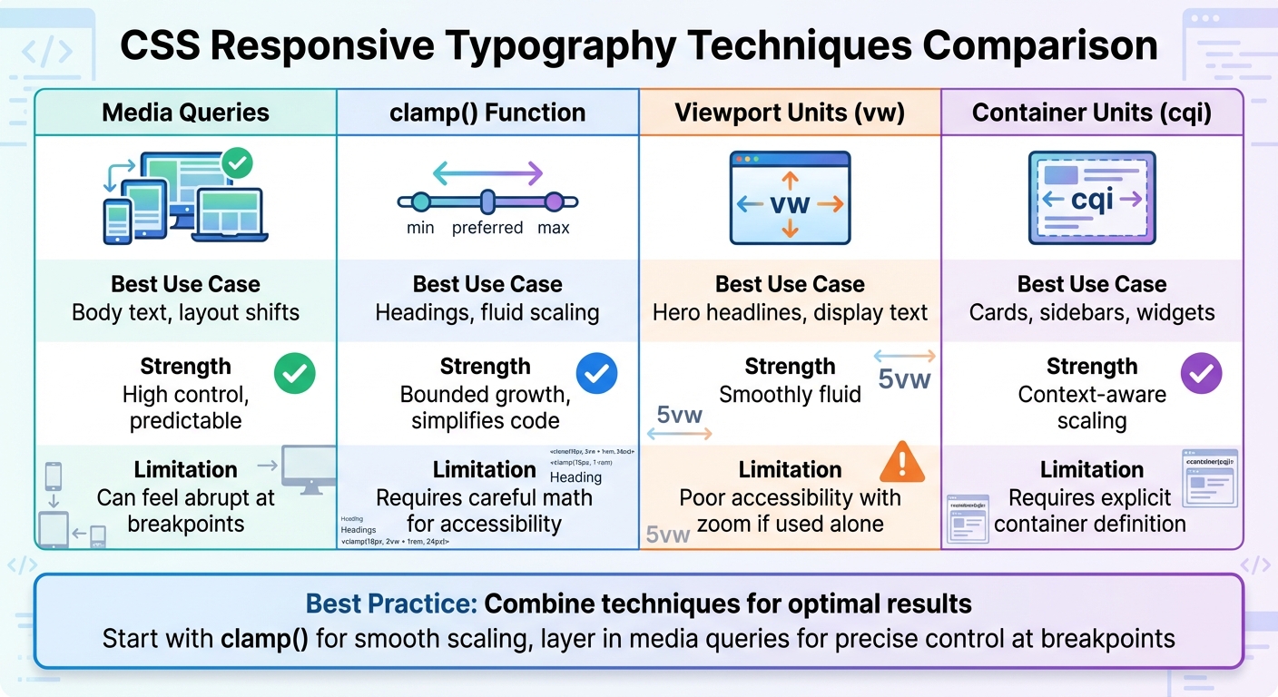
CSS Responsive Typography Techniques Comparison: Media Queries vs clamp() vs Viewport Units vs Custom Properties
No single CSS method can handle every responsive typography challenge. Media queries offer precise adjustments at specific breakpoints, clamp() allows for smooth, fluid scaling, and viewport units bring dynamic responsiveness. The magic happens when you combine these techniques.
Adrian Bece, a full-stack web developer, puts it well:
"Fluid typography shouldn't serve as a replacement for responsive typography, but as an enhancement for specific use-cases instead."
The trick is knowing when to use each tool. Start with clamp() for smooth scaling between breakpoints, then layer in media queries to fine-tune typography at critical layout shifts. This hybrid approach gives you both fluid behavior and precise control, creating a system that adapts beautifully to different screen sizes.
Layering Techniques for More Control
Using CSS custom properties to define your typography scale makes it easier to tweak the entire system with just a few changes. When you combine methods, you can fine-tune typography without overcomplicating your code.
For accessibility, include a rem value in your clamp() calculations, such as clamp(1rem, 2vw + 1rem, 2rem). This ensures text scales properly when users zoom in their browsers, addressing a common issue with pure viewport units. Maxwell Barvian offers a helpful guideline:
"If the maximum font size is less than or equal to 2.5 times the minimum font size, then the text will always pass WCAG SC 1.4.4, at least on all modern browsers."
For components like cards, consider container query units (cqi) instead of viewport units (vw). These scale typography relative to the parent container, offering more context-aware adjustments.
| Technique | Best Use Case | Strength | Limitation |
|---|---|---|---|
| Media Queries | Body text, layout shifts | High control, predictable | Can feel abrupt at breakpoints |
| clamp() | Headings, fluid scaling | Bounded growth, simplifies code | Requires careful math for accessibility |
| Viewport Units (vw) | Hero headlines, display text | Smoothly fluid | Poor accessibility with zoom if used alone |
| Container Units (cqi) | Cards, sidebars, widgets | Context-aware scaling | Requires explicit container definition |
Testing Typography Across Devices
Once your scalable system is in place, thorough testing ensures everything works seamlessly across devices. Test across the full range of viewports - from 320px (small mobile) to 1200px+ (large desktop). Pay extra attention to intermediate sizes like 768px to 1024px, where scaling can sometimes feel off if the slope is too steep.
Check at 200% browser zoom to ensure your text meets WCAG 1.4.4 (Resize Text) requirements. If text doesn't scale enough, adjust the vw coefficient in your clamp() function or increase the minimum value for smaller screens.
For readability, control line length using the ch unit with a max-width. Aim for 45–75 characters per line on desktop and 35–45 on mobile. Keep in mind that desktop users usually sit 24–31 inches from their screens, while phone users hold their devices 12–16 inches away. Testing on actual hardware is crucial for real-world accuracy.
Finally, use fluid typography calculators to visualize scaling curves and ensure heading levels don’t overlap at certain breakpoints. This step-by-step testing ensures your layered techniques work harmoniously, creating a system that feels natural across all devices - not just at the extremes.
Conclusion
This guide has covered various CSS techniques that work together to create an effective responsive typography strategy. Tools like media queries offer precise control at breakpoints, CSS custom properties simplify scaling across your site, viewport units provide smooth fluidity, and clamp() ensures that fluidity stays within readable limits. Combining these methods allows for seamless text scaling.
The benefits for accessibility are substantial. With clamp() now supported by over 90% of browsers, you can ensure text scales up to 200% for users who need larger fonts, all while respecting browser preferences. Websites with better typography accessibility often see conversion rates improve by 12–18%.
To ensure your typography works well, test it at 200% zoom and across a range of viewports (from 320px to 1200px or more). Aim for optimal line lengths of 45–75 characters to maintain readability in practical scenarios.
If you're not diving deep into CSS coding, platforms like those listed on Top Website Builders often include built-in responsive typography features. These systems handle the complex calculations and accessibility measures for you, so you can focus on content and design. Whether coding manually or using these tools, the goal is the same: create text that scales smoothly, respects user preferences, and remains readable on any device.
In short, prioritize typography that ensures readability and accessibility for everyone.
FAQs
When should I use clamp() instead of media queries?
The clamp() function is a fantastic tool for achieving fluid, responsive typography that adjusts effortlessly across various devices. It allows you to set three values: a minimum size, a preferred (fluid) size, and a maximum size. This eliminates the need for multiple media queries, making your code easier to manage and more adaptable.
While media queries are effective for handling specific breakpoints, clamp() offers a smoother and more continuous scaling experience. It's an elegant solution for both typography and layout dimensions, ensuring your design remains consistent and flexible.
How do I pick good typography breakpoints?
When designing typography for responsive screens, it's crucial to allow text to scale seamlessly across different devices. A great way to achieve this is by using CSS functions like clamp(). This function lets you define a minimum, preferred, and maximum font size, ensuring your text adjusts fluidly without breaking the design.
Instead of relying on fixed pixel values for breakpoints, opt for fluid units like vw (viewport width) or vh (viewport height). These units adapt to the screen size, making your typography more flexible. After implementing, thoroughly test your design on various devices to ensure the text remains readable and visually appealing, no matter the screen size.
How can I keep fluid type WCAG-compliant at 200% zoom?
To make sure fluid typography aligns with WCAG standards at 200% zoom, you can use the CSS clamp() function to create flexible font sizes that adjust dynamically. For instance:
font-size: clamp(16px, 2vw, 22px);
This method ensures text remains readable by scaling between a defined minimum and maximum size. Be sure to test your typography at different zoom levels and use scalable units like vw or em to meet accessibility guidelines effectively.


