Responsive web design means making websites work well on any screen size, from phones to large monitors. The key tool for this is CSS media queries, which let you apply different styles based on device characteristics like screen width, orientation, and user preferences (e.g., dark mode). Instead of building separate sites for mobile and desktop, one responsive site adjusts automatically, often built using top website builders that handle these technical details.
Key Points:
- Media Queries: These CSS rules adapt layouts based on conditions like
min-widthororientation. - Mobile-First Design: Start with styles for smaller screens and add changes for larger ones using
min-width. - Viewport Meta Tag: Ensures proper scaling on mobile devices.
- Advanced Features: Target high-resolution screens, user preferences, or input methods (e.g., touch vs mouse).
- Testing: Use browser DevTools and services like BrowserStack to check designs on various devices.
Responsive design improves usability, search rankings, and accessibility. Learn how to use media queries effectively for layouts that work across all devices.
Media Query Syntax and Structure
Basic Media Query Syntax
A media query starts with @media, followed by conditions in parentheses, and is wrapped in curly braces containing CSS rules:
@media (min-width: 768px) {
  .container {
    max-width: 1200px;
  }
}
You can also specify a media type like screen, print, or speech before the conditions. If no media type is included, the default is all, which applies to all devices. Modern CSS introduces a range syntax with comparison operators like >=, <=, >, and <, offering a more intuitive alternative to the older min-width and max-width. For example, @media (width >= 768px) can replace @media (min-width: 768px).
To create more complex queries, combine conditions using and, commas (acting as OR), or not for negation:
@media (min-width: 768px) and (orientation: landscape) {
  /* Styles for tablets in landscape mode */
}
Mastering this syntax is essential for building responsive designs that adapt to different devices and user needs.
Common Media Query Features
Once you understand the syntax, media query features let you fine-tune layouts for various scenarios. Popular features like min-width and max-width are used to define breakpoints, enabling designs to shift from a mobile-friendly single column to a desktop-friendly multi-column layout at specific widths (e.g., 768px).
The orientation feature identifies whether a device is in portrait (height is greater than or equal to width) or landscape (width exceeds height) mode. This is especially useful for tablets and smartphones. The resolution feature targets pixel density, allowing you to serve sharper images to devices with high-resolution screens, like those with Retina displays.
Modern media queries go beyond screen dimensions. They can adapt to user preferences, such as prefers-color-scheme for dark mode or prefers-reduced-motion for accessibility. Interaction features, like hover and pointer, let you customize interfaces based on input methods, ensuring touch users have larger, easier-to-tap buttons.
| Feature Category | Common Features | Use Case |
|---|---|---|
| Viewport | width, height, aspect-ratio |
Adjusting grid layouts for different sizes |
| Display | resolution, orientation |
Serving high-res images or landscape layouts |
| Interaction | hover, pointer |
Optimizing buttons for touch devices |
| User Preference | prefers-color-scheme, prefers-reduced-motion |
Supporting dark mode or reducing animations |
Using the Viewport Meta Tag
For media queries to work correctly on mobile devices, setting the viewport is critical. Without it, mobile browsers simulate a 980px desktop viewport, scaling the page and often breaking responsive layouts.
To fix this, include the following meta tag in your HTML <head>:
<meta name="viewport" content="width=device-width, initial-scale=1">
Here’s what it does:
width=device-width: Matches the device’s actual width in device-independent pixels.initial-scale=1: Ensures the page starts at a 1:1 zoom level.
This small addition ensures your responsive design behaves as expected, even when users rotate their devices or view your site on smaller screens.
sbb-itb-94eacf4
CSS Media Queries & Responsive Web Design tutorial for Beginners
How to Write Media Queries
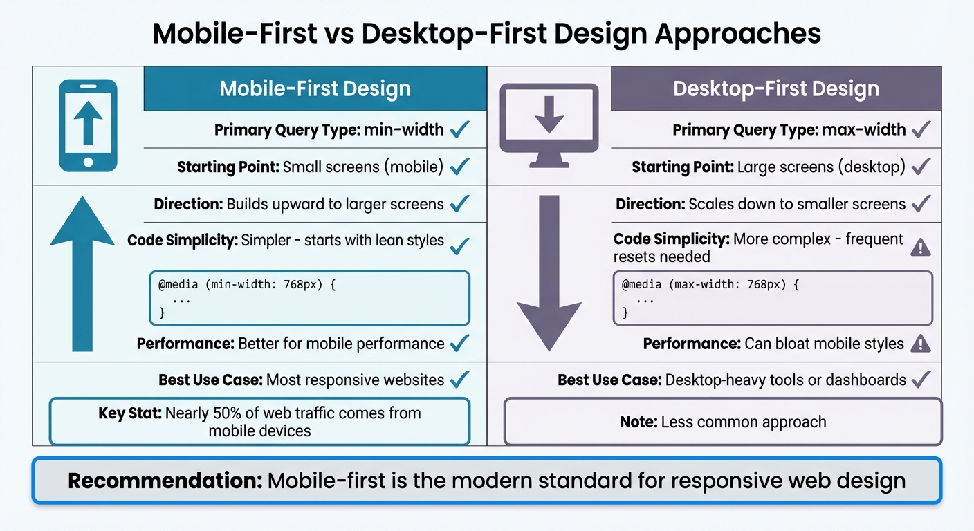
Mobile-First vs Desktop-First CSS Media Query Approaches Comparison
Let's dive into some practical strategies for crafting effective media queries, building on the syntax and features we've covered.
Mobile-First vs Desktop-First Design
When structuring your media queries, the starting point matters - are you building for mobile or desktop first? Mobile-first design begins with styles for smaller screens and uses min-width queries to add styles as the screen size increases. On the flip side, desktop-first design starts with larger screens and uses max-width queries to scale down for smaller devices.
Mobile-first design is the go-to approach for most modern responsive websites. Why? Nearly 50% of web traffic comes from mobile devices. This method keeps the initial CSS lean and adds complexity only as screens grow larger. The cascade works upward, layering additional styles for bigger viewports.
Desktop-first design, while less common, has its place - like in specialized tools or dashboards primarily used on desktops. However, it can lead to bloated CSS for mobile devices due to frequent overrides.
| Approach | Primary Query | Code Simplicity | Performance | Best Use Case |
|---|---|---|---|---|
| Mobile-First | min-width |
Simpler, starts with lean styles | Better for mobile performance | Most responsive websites |
| Desktop-First | max-width |
More complex, frequent resets | Can bloat mobile styles | Desktop-heavy tools or dashboards |
Now, let’s see how relative units can fine-tune your breakpoints.
Using Relative Units for Breakpoints
Breakpoints defined with em or rem units make your layout more adaptable, especially for users who adjust their browser's font size. For example, if someone increases their base font size from 16px to 20px, a breakpoint set at 48em (commonly 768px) will adjust proportionally.
Here’s the key: in media queries, em units are tied to the browser’s default font size, not custom sizes in your CSS. So, @media (min-width: 48em) will typically evaluate to about 768px but will scale up if the user changes their settings. This makes your design more accessible without requiring extra effort - an inclusive win.
Finally, let’s talk about keeping your media queries organized for long-term success.
Grouping and Organizing Media Queries
The way you organize media queries can make or break your code’s maintainability. Here are two popular approaches:
- Component-Based Organization: Place media queries directly after the base styles for each component. This keeps all related code in one spot, making it easy to update individual components (like a navigation bar) without hunting through your stylesheet.
- Breakpoint-Based Grouping: Collect all styles for a specific viewport width at the end of your stylesheet. This method provides a clear overview of how the layout changes at each breakpoint.
Whatever method you choose, consistency is key. Define your breakpoints early and stick to them to avoid "breakpoint creep." And remember, don’t target specific devices - there are over 24,000 unique Android devices out there. Instead, use browser DevTools to resize your viewport and add breakpoints where your layout starts to break down. This content-driven approach ensures your design adapts gracefully across an endless variety of screen sizes.
Advanced Media Query Techniques
Advanced web building tools and media queries allow you to fine-tune styles for specific devices and user interactions, addressing the complexities of modern displays and input methods.
Targeting High-Resolution Displays
High-resolution screens, such as Retina displays on iPhones or 4K monitors, pack more pixels into the same physical space, which can make standard images appear blurry. To tackle this, the resolution media feature lets you serve sharper assets to devices with higher pixel densities, such as 2dppx (dots per pixel) or 192dpi (dots per inch).
For simplicity, use dppx units - they directly represent the device's pixel ratio. For instance, a 2dppx screen has double the pixel density of a standard display, so you'd provide a sharper image, like logo@2x.png. To ensure compatibility with older browsers, include the non-standard -webkit-min-device-pixel-ratio as a fallback:
@media (min-resolution: 2dppx), (-webkit-min-device-pixel-ratio: 2) {
  .logo {
    background-image: url('logo@2x.png');
    background-size: 200px 100px;
  }
}
"The resolution feature is not necessarily supported across all browsers and for a more foolproof approach we can also add an additional non-standard -webkit-min-device-pixel-ratio feature with a value of 2." - DigitalOcean
For displays with enhanced color ranges, the color-gamut: p3 feature can target devices supporting a color range 25% wider than sRGB. Pair it with CSS's color(display-p3 ...) function to deliver vibrant visuals. Similarly, HDR monitors can be identified using dynamic-range: high, enabling adjustments for brightness and contrast to enhance image quality.
Combining Multiple Conditions
To refine your responsive design, you can combine media query conditions using and for specificity. For instance, @media (min-width: 768px) and (orientation: landscape) applies styles only when a tablet is held horizontally. Alternatively, use commas to create "or" conditions - @media (min-width: 1200px), (orientation: portrait) applies styles if either condition is met.
This approach ensures your layout adapts seamlessly to critical breakpoints, avoiding design issues at awkward screen sizes. Combining width and orientation queries allows for tailored, precise adjustments.
Using Media Queries with Interaction Features
Screen size alone doesn't reveal how users interact with your site. A laptop with a touchscreen requires different considerations than a desktop with a mouse. The pointer feature identifies the primary input method: coarse for touchscreens (fingers), or fine for precise tools like mice or trackpads. For example, use @media (pointer: coarse) to increase button sizes - Apple suggests a minimum of 44px for touch targets - while keeping layouts compact for mouse users.
The hover feature addresses "hover traps", where essential information is hidden behind hover states that touch users can't activate. Use @media (hover: none) to display that information by default. For hybrid devices, such as tablets paired with Bluetooth mice, any-pointer and any-hover detect all connected input types, ensuring your design accommodates taps, clicks, or both seamlessly.
Implementation and Testing
Once you've written your media queries, the next step is to create layouts that adjust seamlessly using Flexbox and CSS Grid, followed by thorough testing across different screen sizes.
Responsive Layouts with Flexbox and Grid
After mastering media queries, it's time to implement flexible layouts using Flexbox and CSS Grid. Start with mobile-first styles, then layer in additional styles using min-width media queries.
With Flexbox, use flex-wrap: wrap to let items flow naturally. Set the default flex-direction to column for mobile screens, then switch to row for larger screens (e.g., at 768px). Adjust flex-basis to control item width, such as 100% for mobile and 50% for tablets.
CSS Grid simplifies two-dimensional layouts. Start with a single-column grid (grid-template-columns: 1fr) and expand it at breakpoints. For instance, use repeat(2, 1fr) at 768px and repeat(3, 1fr) at 1024px. For even more flexibility, try intrinsic grids with grid-template-columns: repeat(auto-fit, minmax(200px, 1fr)).
For modular components, container queries (@container) are a game-changer. They allow elements to adapt based on the width of their parent container rather than the viewport. Once your layouts are in place, test them rigorously to ensure they behave as expected.
Testing Media Queries with DevTools
Browser DevTools are invaluable for testing your responsive designs. Both Firefox and Chrome let you simulate various devices, viewports, orientations, and pixel densities. Open DevTools (F12 or Cmd+Option+I on Mac), toggle the device simulation view, and test with preset devices or custom dimensions. Resize the viewport to identify breaking points and refine your breakpoints accordingly.
For real-world testing, services like BrowserStack let you see how your designs perform on actual devices, including phones, tablets, and different browsers. This helps catch issues that emulators might miss. Additionally, use JavaScript's window.matchMedia() to test functional changes triggered by your CSS media queries.
These testing strategies ensure your layouts are polished and responsive across all devices.
Examples of Responsive Design
Practical examples highlight how media queries address layout challenges. A common approach is using a hamburger menu for small screens, switching to a horizontal menu for screens wider than 768px. Similarly, progressive disclosure techniques can simplify interfaces: a login button might show only an icon on mobile, a shortened label on tablets, and full text on desktops.
Don't forget about print and accessibility. Use @media print to hide unnecessary elements and adjust colors for better print readability. Accessibility-focused features like prefers-reduced-motion and prefers-color-scheme allow you to customize animations and color schemes based on user preferences.
"Responsive design has implications for conversion rates, SEO, bounce rates, and more." - Tomislav Krnic, Verified Expert in Engineering
Conclusion
Media Query Basics Recap
Media queries are at the heart of responsive web design. They act as conditional rules that guide browsers on how to display content based on device characteristics. A typical media query includes three parts: a media type (like screen or print), a media feature (such as min-width: 768px or the newer range syntax like width >= 768px), and the associated CSS rules.
But media queries go beyond just layout tweaks. They now account for user preferences, such as dark mode (prefers-color-scheme), reduced motion (prefers-reduced-motion), and high contrast settings (prefers-contrast). This shift has made websites more inclusive and user-friendly. As front-end developer Juan Diego Rodríguez explains:
"It is undeniable that media queries have evolved toward accessibility solutions, making space for other CSS features to take responsibility for responsiveness."
These basics are the building blocks of responsive design, helping create adaptable and accessible web experiences.
Tips for Better Responsive Design
To refine your responsive designs, keep these tips in mind:
- Start with a mobile-first approach. Write base styles for smaller screens, then layer on styles for larger viewports using
min-widthqueries. - Use em or rem units for breakpoints. This allows layouts to adapt to user settings like font size.
- Define breakpoints based on how your content behaves, not specific devices. This ensures flexibility across a range of screen sizes.
- Configure the viewport properly to ensure your designs display as intended on all devices.
- Whenever possible, test on real devices. While browser DevTools are great for initial checks, actual hardware testing uncovers details like touch interactions and performance issues that simulators might miss.
FAQs
How do I choose the right breakpoints?
Instead of focusing on specific devices, base your breakpoints on the needs of your design and content. The key is to pinpoint where your layout starts to "break" or requires adjustments as screen sizes change. While common breakpoints like 600px, 768px, 992px, and 1200px can serve as helpful starting points, it's better to tailor them to fit your content.
To ensure everything works smoothly, test your design on actual devices or reliable emulators. Adopting a mobile-first approach is another smart move - it helps create a user experience that feels natural and seamless, no matter the screen size.
When should I use em or rem for breakpoints?
When choosing between rem and em for breakpoints, it helps to understand their specific strengths:
- Use rem when you need a consistent, global reference tied to the root font size. This ensures accessibility and predictable scaling across the entire site.
- Opt for em when breakpoints need to adapt to the font size of a parent element, offering more localized and flexible scaling.
In short, rem is ideal for maintaining site-wide uniformity, while em is better suited for situations where component-specific adjustments are necessary.
Do I still need the viewport meta tag?
The viewport meta tag plays a crucial role in responsive web design. It tells the browser how to control the page's dimensions and scaling, ensuring your layout adapts smoothly to various screen sizes. Without this tag, your design might not scale correctly or display as expected on different devices, making it harder to deliver a seamless user experience.
