A language switcher is a small but critical part of any multilingual website. It helps users select their preferred language, improving how they interact with your content. Here's what you need to know:
- Placement Matters: The top-right corner of the header is the most common and user-friendly spot. Alternatives include the footer, a floating button, or the mobile hamburger menu.
- Design for Clarity: Use simple icons like a globe (🌐) and label languages in their native names (e.g., "Español" instead of "Spanish"). Avoid using flags, as they represent countries, not languages.
- Functionality is Key: Allow manual selection, save user preferences (via cookies), and keep users on the same page when switching languages. Auto-detection can help but should never override user control.
- Accessibility: Ensure the language switcher is easy to use with keyboards, screen readers, and touch devices. Use ARIA attributes and semantic HTML for better usability.
- Global Considerations: Support right-to-left (RTL) languages like Arabic and Hebrew, and ensure proper typography for different scripts.
Core Principles for Language Switcher Design
Making the Switcher Visible and Accessible
Your language switcher needs to grab attention right away - especially for users who land on a page in a language they didn’t intend. If they can’t locate it within seconds, they might assume the site doesn’t support their language and leave.
Positioning is everything. The top-right or top-left corner of the header is where most users naturally look first. Alternatively, you can place it in the footer for consistency across pages. On longer pages, consider adding a floating button in the bottom-right corner that remains visible as users scroll. This design choice aligns with natural eye movement patterns and ensures constant accessibility.
"A language switcher should always be visible or at least one click away. When it comes to language access, accessibility should always outweigh aesthetic minimalism." - Aorinka Anendya
Accessibility is equally important. The switcher must be usable by everyone, including those navigating with keyboards or assistive devices. To achieve this, incorporate ARIA attributes like aria-label, aria-haspopup, and aria-expanded so screen readers can interpret the switcher correctly. It should also be fully operable with a keyboard, and on mobile devices, ensure touch targets are large enough to avoid accidental taps.
Once visibility and accessibility are addressed, it’s time to focus on creating a design that’s instantly recognizable.
Keeping the Design Simple and Recognizable
Simplicity makes recognition effortless. Users should be able to spot the language switcher at a glance, without needing to read any text. A globe icon (🌐) or a universal translation symbol works well to visually signal language options.
When listing languages, always use their native names. For example, display "Español" instead of "Spanish", "Deutsch" instead of "German", and "日本語" instead of "Japanese." This helps native speakers quickly identify their language without having to mentally translate the options. Avoid using flags to represent languages - they’re symbols of countries, not languages, and can lead to confusion or even political sensitivities.
"Flags were never created to depict languages nor do they represent them." - United Language Group
For sites offering many language options, keep the switcher tidy. Use dropdown menus or search-enabled modals to maintain a clean, uncluttered interface. This ensures users can easily navigate even a long list of languages without feeling overwhelmed.
sbb-itb-94eacf4
Where to Place Language Switchers
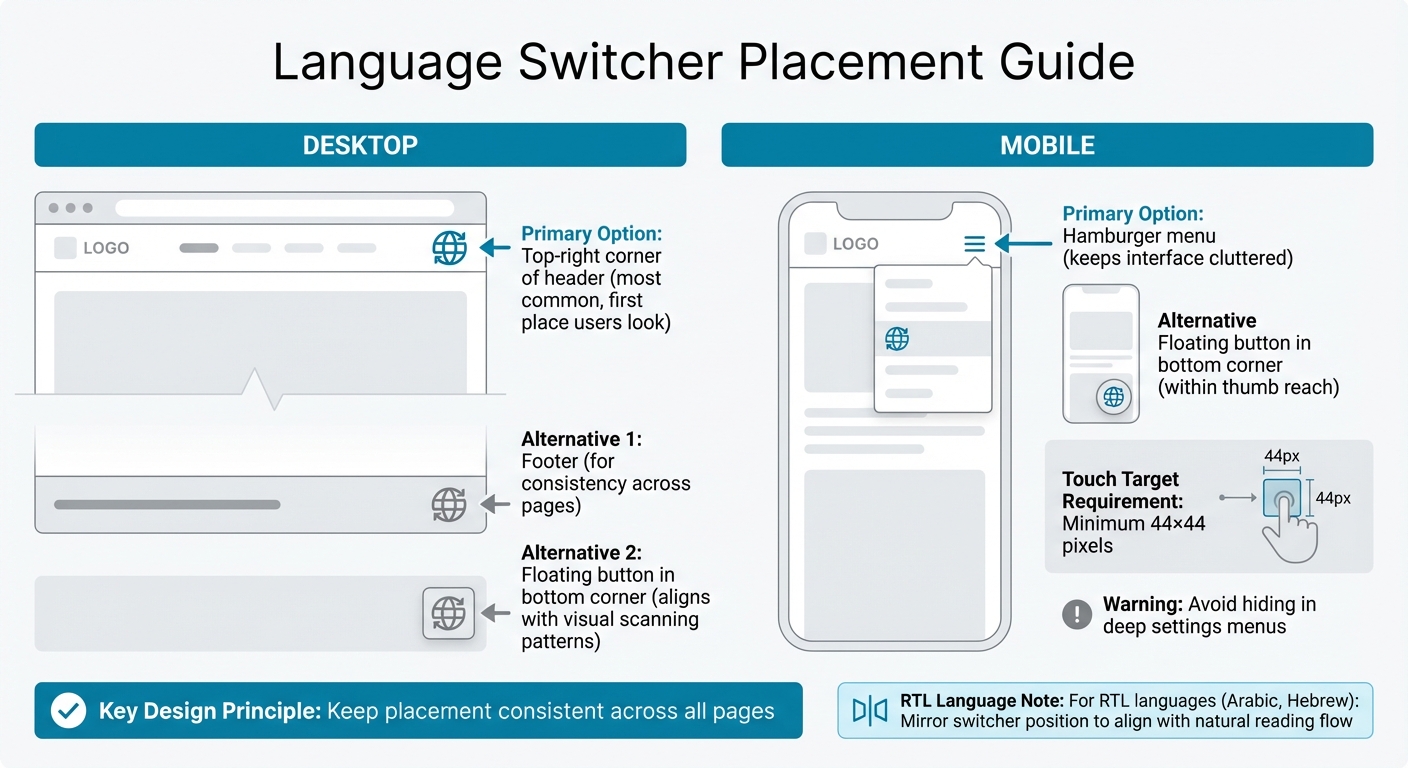
Language Switcher Placement Guide: Desktop vs Mobile Best Practices
Desktop Website Placement
For desktop websites, the top-right corner of your header is an ideal spot for the language switcher - it’s one of the first places users look. If your header is already packed with elements, consider alternatives like the footer or a floating button in the bottom corner, which aligns with users' natural visual scanning patterns.
Mobile Interface Placement
Mobile design requires a more compact approach. A great option is to embed the language switcher within the hamburger menu, keeping the interface uncluttered. Another effective choice is a floating button in the bottom corner, positioned within easy reach of a user’s thumb. Avoid hiding the switcher in deep settings menus, and ensure touch targets are large enough - at least 44×44 pixels - for seamless interaction.
"Placing your language button in the bottom right of your webpage means it falls into the terminal area of an individual's vision which is essentially where they're most likely to rest their eyes and engage with the language button."
– Weglot
Keeping Placement Consistent Across Pages
Consistency is crucial. Placing the language switcher in the same location on every page helps users quickly locate it, building trust and familiarity. For RTL (right-to-left) languages like Arabic or Hebrew, mirror the switcher’s position to align with the natural reading flow.
"Keep its placement consistent across all pages so users who switch languages frequently can find it easily at any time."
– Linguise
How to Label Language Switchers
Display Language Names in Their Native Form
Labeling plays a crucial role in making language switchers intuitive and user-friendly. A good practice is to display language names in their native scripts. For instance, use "Español" instead of "Spanish", "日本語" instead of "Japanese", and "Deutsch" instead of "German." This makes it easier for users to quickly identify their preferred language.
For websites with a global audience, hybrid labels can be helpful. These combine the native name with its English translation, such as "日本語 (Japanese)" or "العربية (Arabic)." This approach caters to multilingual users and simplifies navigation for site administrators. To ensure readability, use fonts tailored to each script, like Noto Sans JP for Japanese or Tajawal for Arabic, especially at smaller sizes.
When symbols are required instead of text, other labeling methods should be considered.
Why Flags Can Be Problematic
Flags may seem like a straightforward choice, but they often create confusion. Flags represent countries, not languages, and this distinction matters. For example, English is spoken in the US, UK, Australia, and Jamaica, but no single flag can represent all English speakers. Similarly, countries like Switzerland have multiple official languages, making a single flag insufficient to represent them.
"Flags were never created to depict languages nor do they represent them."
– United Language Group
In May 2022, Apple addressed this issue by replacing country flags with character-based icons in macOS 12.4 Monterey, removing national associations. If flags must be used - for instance, to distinguish between US English and UK English - always pair them with clear text labels. However, for general language selection, it's best to avoid flags altogether.
Using Icons and Symbols
To sidestep the challenges of using flags, symbols can provide a more effective alternative. The globe icon (🌐) is widely recognized for language settings and works well when paired with a downward arrow (▾) to indicate a dropdown menu. Avoid icons like speech bubbles, as users often associate these with chat or customer support.
Keep icons simple and always include text labels to ensure clarity and accessibility, especially for screen readers. If space is limited and an icon-only switcher is used in the header, consider adding a fully labeled text-based switcher in the footer as a backup option. This ensures all users can easily navigate language settings.
Improving Language Switcher Functionality
Auto-Detecting User Language
Automatically detecting a visitor's language can enhance their experience by displaying content in their preferred language right away. To do this effectively, follow a priority order: user profile > URL parameters > cookies/localStorage > browser language > IP geolocation. Use tools like the HTTP Accept-Language header and navigator.languages for detection. However, avoid relying solely on IP geolocation since it can be inaccurate due to VPNs, travel, or multilingual regions. Instead of forcing a redirect based on detection, display a non-intrusive banner suggesting a language switch. Always include a manual switcher so users can override the automatic selection.
It’s also important to separate language, shipping location, and currency settings. For instance, a visitor in Germany might prefer reading in English but still want to pay in euros.
To improve the experience further, ensure that language changes don’t disrupt the user’s current activity.
Keeping Users on the Same Page
When users switch languages, they should stay on the same content rather than being redirected to the homepage. For example, if a user is on /en/pricing, switching to French should take them to /fr/pricing. Maintaining this continuity helps avoid confusion and reduces unnecessary navigation. To make this work, ensure every page has a corresponding URL in each supported language, and configure the language switcher to dynamically generate the correct destination link.
Additionally, preserving the user’s scroll position during the switch can make the transition feel more seamless, especially on longer pages.
Lastly, make sure to save these preferences for future visits.
Saving User Language Preferences
Keeping track of a user’s language preference ensures they’ll see the right content when they return. Store this information in cookies (valid for roughly one year) or in the user’s profile for consistency across devices. When loading a page, the localization middleware should first check for a stored cookie before falling back to browser headers or IP-based detection.
To comply with privacy standards, classify language preference cookies as essential so they remain active even if a user opts out of non-essential tracking. Use a returnUrl parameter to ensure users stay on their current page after switching languages. This approach helps create a smooth and user-friendly experience throughout your site.
Making Language Switchers Responsive and Accessible
Designing for Mobile Devices
When designing for mobile, language switchers need to be compact yet functional. A smart approach is to tuck the switcher into the hamburger menu or use a floating button to keep it accessible without cluttering the screen.
For usability, ensure touch targets are large enough - at least 44×44 pixels - to prevent accidental taps. These tweaks for mobile complement the desktop strategies, creating a seamless experience across devices.
Testing for Right-to-Left Languages
Making your interface work for right-to-left (RTL) languages like Arabic and Hebrew is crucial for global accessibility. To achieve this, set dir="rtl" on the <html> tag, which automatically mirrors the layout, including navigation menus, sidebars, and directional icons. Using CSS logical properties, such as margin-inline-start, can simplify this process and ensure layouts adapt effortlessly.
Typography is another key consideration. For example, Arabic text often needs a line height of 1.7–1.8 to avoid cramped characters, compared to 1.5 for Latin scripts. Avoid applying letter-spacing to Arabic text, as its cursive nature requires characters to remain connected. Additionally, while you should mirror directional icons like arrows, universal symbols like search icons, settings gears, and brand logos should stay as they are.
Supporting Keyboard and Screen Reader Users
Accessibility isn’t just about responsiveness - it’s about inclusivity. Ensure the language switcher is fully operable via keyboard, using keys like Tab, Enter, and Space. Add ARIA attributes (aria-label, aria-haspopup, aria-expanded, aria-current) to enhance clarity for screen readers. Structure the switcher with semantic HTML, such as a <nav> container and <ul>/<li> for the language list, for better organization.
Highlight the active language with aria-current="page" and provide a visual cue that doesn’t rely solely on color. Use the lang attribute for each language option (e.g., <a href="..." lang="fr">Français</a>) so screen readers pronounce the names correctly.
"If you're linking to pages in German and Chinese, label them as 'Deutsch' and '中文' - not 'German' and 'Chinese'." - robertjelenic.com
Summary
Creating an effective language switcher involves focusing on visibility, clarity, and giving users control. To make it easy to find, place the switcher where users naturally look - this is often in the top-right corner of the header, the footer, the mobile hamburger menu, or even as a floating button for quick access.
When it comes to design, avoid relying solely on flags. Flags represent countries, not languages, and can be misleading. Instead, opt for a universally understood symbol like a globe icon to indicate language options.
Functionality matters just as much as placement. While features like auto-detection based on IP or browser settings can be helpful, they often fall short - especially for users traveling or using VPNs. That’s why offering a manual override and saving preferences (through cookies) is crucial. Additionally, keeping users on the same page during a language switch and allowing them to choose language, location, and currency separately makes the experience smoother and more user-friendly.
These thoughtful design and functionality choices not only improve accessibility but also build trust and expand global reach. Here’s a striking fact: 72.4% of consumers are more likely to make a purchase when information is available in their language, and every $1 spent on localization delivers a $25 return. By following this guide, you can ensure every element - from design to functionality - works together to engage users across the globe effectively.
FAQs
Should I auto-switch a user’s language on first visit?
When users visit a site for the first time, it’s best to avoid automatically switching their language. Instead, let them choose their preferred language manually. Auto-switching might lead to confusion or frustration if the detected language doesn’t align with what they prefer. Offering a clear and easily accessible language selection option improves usability and gives users control over their browsing experience.
How can I keep users on the same page after switching languages?
To make sure users remain on the same page after changing languages, set up the language switcher to reload the current URL in the chosen language. You can achieve this by using methods like URL parameters or cookies to retain the page or even the exact scroll position. Positioning the switcher in a clear and easy-to-find spot improves usability, allowing visitors to switch languages seamlessly without losing their place on your site.
What’s the best way to handle language, location, and currency separately?
To make language, location, and currency settings more user-friendly, treat them as separate choices rather than bundling them together. This allows users to customize their preferences independently. Use clear icons or text labels to guide users and enhance accessibility. Instead of relying on automatic redirects, give users the ability to manually adjust these settings without hassle. Place these options in intuitive spots, such as the header or top navigation, so they're easy to find. This approach creates a smoother and more adaptable experience for all users.