Color choices matter more than you think. They influence how users perceive your brand, build trust, and even impact conversions. But here's the catch: colors don't mean the same thing everywhere. A shade that works in one country might offend in another. For example, red symbolizes prosperity in China but signals danger in Western finance.
Key takeaways:
- Colors carry different meanings across regions: White means purity in the U.S. but mourning in East Asia.
- Cultural context shapes user perception: Using green in Islamic regions can resonate positively, while a "green hat" in China might not.
- Localized colors boost engagement: Research shows culturally aligned designs can increase user trust and conversions significantly.
Want to succeed globally? Understand the local meanings of colors, test your designs with native users, and use tools like Coolors or GeoTargetly to refine your palette. Your color choices can make or break your global strategy.
How Does Culture Influence Global Color Interpretation? - Graphic Design Nerd
sbb-itb-94eacf4
Color Symbolism Across Cultures
Color Meanings Across Cultures: Western, East Asian, Middle Eastern, and Indian Interpretations
Colors carry meanings that vary widely depending on cultural context. A shade that conveys trust in one part of the world might symbolize mourning or even caution elsewhere. These associations are deeply rooted in history, religion, and tradition, making it crucial to grasp these differences when creating designs for a global audience. This understanding is key when localizing web interfaces.
"Colour isn't universal. A shade that signifies trust in the UK can signal mourning in Asia." - Stuart L. Crawford, Creative Director, Inkbot Design
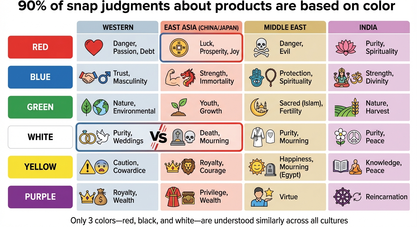
Interestingly, up to 90% of snap judgments about products are based solely on color. This means that choosing the wrong palette doesn’t just affect how something looks - it can erode trust and even hurt conversions. However, there’s a universal constant: only three colors - red, black, and white - are understood similarly across all cultures. Beyond these, meanings differ significantly. Let’s dive into how key colors are perceived in different parts of the world.
Color Meanings in Western Cultures
In the United States and much of Europe, blue is often the go-to color for conveying trust and authority. Banks, insurance companies, and tech firms frequently use it because it rarely carries negative connotations. Red, on the other hand, can signal urgency, passion, or danger. In financial contexts, being "in the red" refers to debt or losses.
White is associated with purity and weddings, while black is traditionally connected to mourning and funerals. Purple is linked to royalty and wealth, making it a favorite for luxury branding. Yellow often represents caution, as seen in traffic signs, but it can also symbolize happiness - or even cowardice in some cases.
Color Meanings in Asian Cultures
In Asia, color meanings often differ from Western norms. Red, for example, is highly auspicious in China, symbolizing luck, prosperity, and joy. This is reflected in practices like using red to denote gains in Chinese stock markets - the opposite of Western conventions where red indicates losses. However, in South Korea, writing someone’s name in red ink is a cultural taboo, as it signifies death.
White, which represents purity in the West, is associated with mourning in many East Asian cultures and is commonly used at funerals. Yellow, once the color of imperial royalty in China, represents power and wisdom. Meanwhile, a "green hat" in Chinese culture carries a negative connotation related to infidelity, making it a challenging choice for branding in the fashion industry.
Color Meanings in the Middle East and Other Regions
In Islamic cultures, green holds sacred significance, symbolizing Islam, paradise, and fertility. However, using green on disposable items like trash bags or shoe soles can come across as deeply offensive. Blue is often connected to protection and spirituality in places like Turkey, though in Iran, it can signify mourning.
Yellow varies widely in meaning across the Middle East. In Egypt, it’s associated with mourning, while in other areas, it can symbolize wealth and prosperity. Similarly, purple is tied to death and mourning in countries like Brazil and Thailand, making it less suitable for celebratory designs. In some Middle Eastern regions, orange is linked to loss and mourning.
A UK tea company offers a great example of culturally informed design. By switching its packaging color from pale blue to a rich navy with gold accents - better aligned with local perceptions of luxury and lighting conditions - it increased sales in Dubai by 40% within three months.
| Color | Western | East Asia (China/Japan) | Middle East | India |
|---|---|---|---|---|
| Red | Danger, Passion, Debt | Luck, Prosperity, Joy | Danger, Evil | Purity, Spirituality |
| Blue | Trust, Masculinity | Strength, Immortality | Protection, Spirituality | Strength, Divinity |
| Green | Nature, Environmental | Youth, Growth | Sacred (Islam), Fertility | Nature, Harvest |
| White | Purity, Weddings | Death, Mourning | Purity, Mourning | Purity, Peace |
| Yellow | Caution, Cowardice | Royalty, Courage | Happiness, Mourning (Egypt) | Knowledge, Peace |
| Purple | Royalty, Wealth | Privilege, Wealth | Virtue | Reincarnation |
These insights highlight the importance of researching and applying culturally sensitive color choices, especially in web design and branding for global markets.
Research on Color Preferences in Web Design
Color choices play a big role in shaping how users interact with websites. Studies have shown that the appeal of a site’s colors can strongly influence user trust and satisfaction, which impacts whether someone revisits a site or makes a purchase. When users find a website’s colors appealing, they’re more likely to trust the brand and stick around as loyal customers. This link between color and loyalty makes selecting the right color palette a key business decision. Research also highlights how culturally sensitive color choices can help build trust, complementing earlier findings on how culture affects color perception.
Interestingly, research also points out that long-wavelength colors like red and yellow tend to create higher arousal, while short-wavelength colors like blue and green are more calming. In practice, this means that cooler colors often result in higher user satisfaction, while warmer colors are more stimulating.
Cultural factors add another layer to how users respond to color. When websites align their color schemes with local cultural expectations, users feel a sense of "cultural comfort", making the design more relatable and appealing. For example, in collectivist societies like Pakistan, traditional and contrasting color schemes evoke a sense of familiarity and connection, helping users feel more at ease.
Analysis of Color Patterns in National Websites
How do these insights play out in real-world web design? Researchers studying websites across different countries have uncovered some clear trends. While about 10 colors tend to appear universally in web design, country-specific palettes often reflect local preferences. This suggests that even though there are global design standards, successful localization depends on understanding regional nuances.
Localized websites often stand out for their greater diversity in colorfulness and saturation compared to globalized designs, which tend to stick to more uniform standards. These differences aren’t random - they’re intentional decisions to cater to local tastes. Websites targeting specific regions often feature distinct color choices and layouts that align with cultural aesthetics and traditions, making them more appealing to their intended audiences.
How to Apply Color Preferences in Website Localization
Using Research and Testing to Choose Colors
Picking the right colors for different markets isn't just about aesthetics - it's about understanding cultural nuances and user behavior. A structured localization timeline often includes: cultural research (2–4 weeks), style guide development (1–2 weeks), content adaptation (4–8 weeks), native reviews (1–2 weeks), and ongoing testing.
During the research phase, avoid relying on surface-level interpretations of color, like assuming "red equals luck in China." Instead, dive deeper with a semiotic analysis. This involves studying how colors are used in specific industries and regions. For instance, red might symbolize trust in Shanghai's fintech sector but could carry a completely different tone in retail. Observing competitors can also provide valuable insights - if a particular color is consistently avoided, it could indicate a cultural taboo.
User testing is crucial to validate your choices. A/B testing helps compare color schemes on landing pages targeted at specific markets. Combine this with focus groups, surveys, and interviews to uncover emotional reactions and any overlooked sensitivities. These efforts can lead to impressive results: research shows that localized content can boost conversion rates by up to 47% and increase user engagement by as much as 62%.
Once your designs are finalized, have native speakers review them. Their cultural expertise can catch subtle issues that automated tools might miss. With this feedback in hand, you can confidently move forward with tools to integrate your culturally aligned color palette.
Tools for Implementing Color Customization
After confirming your color choices through research and testing, specialized tools can help streamline the integration process. For instance:
- Coolors: Generates palettes with features like contrast checkers and color blindness simulators.
- Khroma: Uses AI to create palettes tailored to cultural contexts.
- WebAIM Contrast Checker: Ensures your color combinations meet international accessibility standards.
For implementation, tools like GeoTargetly allow you to swap images, CSS styles, and color-coded elements automatically based on a visitor’s IP address - no need to alter your site’s core code. TranslatePress Translation Editor enables real-time previews of localized designs, including how colors interact with different writing systems. Platforms like AB Localization offer structured A/B testing tools designed to test cultural relevance.
Consider adopting a "resilient palette" strategy: keep your logo and primary brand colors consistent to maintain global recognition, but use a flexible secondary palette for marketing materials that can be adjusted for local preferences. Also, test your designs on budget devices, especially in regions where low-cost hardware is common. Low-contrast color schemes may not display well on inexpensive mobile screens. Finally, avoid hard-coding color values; instead, use CSS variables and resource files to ensure scalability across regions.
"Context is content." - Stuart L. Crawford, Creative Director, Inkbot Design
Conclusion
Color is the first thing your brain notices when you land on a website, shaping brand perceptions before you even read a single word. By aligning your color choices with local expectations, you’re not just improving the look of your site - you’re building trust, reducing cognitive strain, and fostering emotional connections that can lead to meaningful business outcomes.
Take McDonald’s as an example. In several European countries, they swapped their classic red-and-yellow branding for green-and-yellow to signal environmental awareness and better match local preferences. This shift highlights how culturally thoughtful color strategies can make a significant impact.
The takeaway is simple: choosing colors that resonate culturally can directly affect engagement and conversions. On the flip side, mismatched colors can create confusion. For instance, using red to indicate a stock market drop in a Chinese app - where red traditionally symbolizes growth - forces users to work harder to interpret the interface, often leading to frustration and abandonment. On the other hand, culturally aligned colors evoke positive emotions: red symbolizes prosperity in China, green is sacred in the Middle East, and blue builds trust, especially in financial contexts.
"When you ignore the cultural weight of your palette, you are essentially walking into a foreign room and shouting in a language nobody speaks." – Stuart L. Crawford, Creative Director, Inkbot Design
The evidence is clear: color isn’t just about aesthetics - it’s a functional tool that can boost brand recognition by up to 80% and generate stronger emotional responses. Whether you’re using professional site builder tools to design a new site or adapting one for a global audience, understanding how colors resonate in different regions is key to making your brand stand out. Your palette speaks before your words ever do.
FAQs
How can I quickly research local color meanings?
To dive into the meanings of colors in a specific region, you can turn to AI tools and guides on color symbolism tailored to different areas. AI platforms are great for pinpointing colors that align with local traditions and preferences, while articles on color meanings can shed light on how colors are perceived in various cultures. These tools not only save time but also help ensure your color choices connect with the local audience and avoid common branding missteps.
What colors are most likely to offend?
Colors carry different meanings depending on where you are in the world, and these interpretations can sometimes clash. For example, red is seen as a symbol of good fortune in China, while in many Western countries, it’s often linked to danger or warnings. Similarly, white is associated with purity and weddings in Western cultures, yet it represents mourning and loss in many Eastern traditions. Then there’s purple - a color tied to royalty and luxury in the West but connected to death in parts of Latin America. Being aware of these cultural associations is crucial when adapting content for a global audience to avoid unintended misunderstandings.
How can I localize colors without changing my brand?
To adjust your brand's colors for different regions while staying true to your identity, consider how cultural meanings influence color perception. Choose shades that evoke positive feelings in each region and steer clear of those linked to negative symbolism.
By adopting adaptable and culturally aware color palettes, you can maintain brand consistency while respecting local traditions. This approach strengthens your connection with diverse audiences and enhances the emotional resonance of your brand across global markets.