Multilingual typography ensures text looks and functions correctly across different languages and writing systems. It’s not just about translating content - it’s about choosing fonts, layouts, and settings that support readability, accessibility, and performance for global audiences. Here’s what you need to know:
- Font Selection: Use Unicode-compliant fonts to avoid missing characters ("tofu"). Options like Google Noto and IBM Plex offer broad language support.
- Script-Specific Needs: Different scripts (e.g., Arabic, Devanagari, CJK) require unique features like contextual shaping, vertical spacing, or bidirectional text handling.
- Performance: Optimize font file sizes using
unicode-rangeto load only the necessary subsets. - Spacing & Layout: Adjust line heights, letter spacing, and alignments to suit each script. For example, CJK scripts need more vertical space, while Arabic avoids letter-spacing.
- Accessibility: Follow WCAG guidelines for contrast, scaling, and spacing. Use
font-display: swapto prevent invisible text during font loading. - Testing: Cross-browser/device testing and feedback from native speakers ensure proper rendering and usability.
Typography impacts how users perceive your content. By tailoring it to their language and script, you create a smoother, more engaging experience.
Font Selection and Character Support
Choosing Unicode-Compliant Fonts
Picking the right Unicode-compliant fonts is a critical step in multilingual typography. Unicode compliance ensures that all characters - whether it's Vietnamese tone marks or Arabic script - render correctly across devices and operating systems.
Start by analyzing your audience. Use website analytics to identify the top 3–5 languages your visitors use most often. Then, focus on fonts that cover those specific Unicode ranges. For instance, Vietnamese requires the Latin Extended Additional block (U+1E00–U+1EFF) for tone marks, while Arabic needs U+0600–U+06FF and U+FB50–U+FDFF for proper character rendering.
It’s not just about character coverage. Complex scripts like Arabic and Devanagari need OpenType features for accurate rendering. Arabic fonts, for example, must include contextual shaping tables (init, medi, fina, isol) to adjust letter forms based on their position in a word. Similarly, Devanagari fonts should support features like akhn and pres for consonant combinations. For Indic scripts, ensure your font supports Zero Width Non-Joiner (U+200C) and Zero Width Joiner (U+200D) to handle conjunct formation properly.
Performance is another key consideration. While a Latin font might only weigh 15–40KB, a full Japanese font can range from 2–20MB due to its 6,000–10,000 glyphs. Use the CSS unicode-range descriptor to load only the font subsets your page uses. This approach avoids large downloads that could slow down your site.
Once you’ve confirmed Unicode support and optimized performance, you can focus on selecting fonts that meet your script-specific needs.
Multilingual Fonts to Consider
Google Noto is one of the most comprehensive font families available, supporting over 150 scripts and more than 800 languages. Designed to eliminate "tofu" (the blank boxes that appear when a character isn’t supported), it’s a go-to choice for broad language coverage. As Bob Jung from Google explains:
When it comes to lesser-used languages, or even the purely academic or dead languages, we think it's really important to preserve them.
Both Noto Sans and Noto Serif are free to use under the SIL Open Font License, making them accessible for any project.
For enterprise websites looking for something with more personality, IBM Plex offers excellent multilingual support. It covers Latin, Cyrillic, Greek, Arabic, Devanagari, Hebrew, and Thai, along with specific variants for Japanese, Korean, and Traditional Chinese. The Arabic variant is particularly praised for its elegant design compared to more generic options.
If your project is Latin-first but requires additional script support, Inter is a solid choice. It includes support for Cyrillic and Greek, along with variable font capabilities for responsive design. For script-specific needs, here are some recommendations:
- Cairo or Noto Naskh Arabic for Arabic
- Sarabun for Thai
- Vazirmatn for Persian
- Be Vietnam Pro for Vietnamese
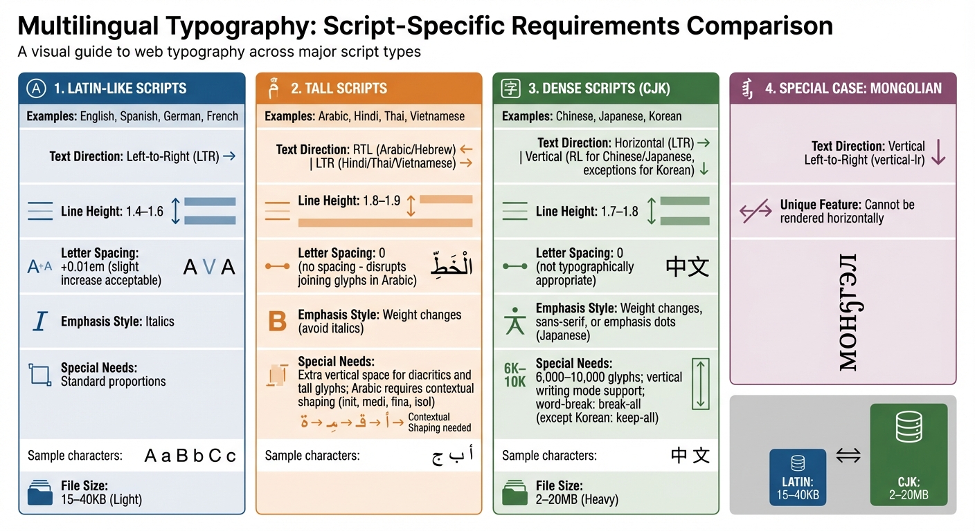
When combining fonts across different scripts, it’s important to match their x-height and stroke weight to maintain consistency. Google groups scripts into three categories to help with this: "Latin-like" (standard proportions), "Tall" (requiring extra line height for scripts like Arabic, Hindi, Thai, and Vietnamese), and "Dense" (needing more vertical space for Chinese, Japanese, and Korean). This classification can guide you in adjusting spacing to ensure visual balance across languages.
sbb-itb-94eacf4
How to make fonts work for different languages
Script-Specific Design Considerations
Multilingual Typography Requirements by Script Type
Working with Different Writing Systems
Designing for different writing systems isn't just about changing fonts - it involves accommodating unique requirements. For instance, while Latin, Cyrillic, and Greek scripts flow left-to-right (LTR), languages like Arabic and Hebrew are read right-to-left (RTL). Chinese, Japanese, and Korean (CJK) scripts support both horizontal and vertical writing modes, while Mongolian is distinct - it’s written vertically from left to right (vertical-lr) and cannot be rendered horizontally.
The number of glyphs and file sizes also vary significantly between scripts, requiring careful subsetting to optimize performance.
Arabic script, for example, depends on OpenType features to manage contextual letter forms, while Indic scripts need support for consonant clusters and vowel reordering. Typography expert Sarah Mitchell explains:
Arabic script needs more vertical space... letter-spacing disrupts joining glyphs.
Spacing also needs to be tailored for readability. For example, a line-height of around 1.8 works well for CJK scripts, while Arabic and Thai benefit from about 1.9. In contrast, Latin scripts typically use a line-height between 1.2 and 1.5. It’s also crucial to avoid adding letter-spacing to Arabic text, which can break the cursive flow, or to CJK text, where it’s not typographically appropriate.
Emphasis styling varies across scripts, too. While italics are common in Latin scripts, they often don’t translate well to others. CJK fonts, for instance, rarely include native italics. Instead, emphasis might be shown through changes in weight, sans-serif styles, or, in Japanese, the use of emphasis dots. Similarly, synthesized italics for Cyrillic can look awkward because true italic glyphs differ significantly from their upright versions.
These nuances highlight the importance of tailoring text direction and layout to each script.
Managing Text Direction and Layouts
Managing text direction effectively starts with the right HTML and CSS practices. The dir attribute in HTML is essential for setting text direction. Applying dir="rtl" or dir="ltr" to the <html> tag (rather than <body>) helps avoid layout issues like misplaced scrollbars. For content with an unknown language, dir="auto" lets the browser determine direction based on the first strong character.
CSS logical properties make layouts adaptable for different text directions. Instead of using physical properties like margin-left or padding-right, opt for margin-inline-start and padding-inline-end, which adjust automatically for LTR and RTL scripts. Similarly, text-align: start ensures proper alignment regardless of text direction.
The writing-mode property controls text flow. For vertical text in Chinese and Japanese, use vertical-rl (lines flow right to left), while Mongolian requires vertical-lr. To display short horizontal sequences, such as numbers, within vertical text, use text-combine-upright.
Handling bidirectional text, like Arabic or Hebrew mixed with LTR elements (e.g., numbers), often relies on the Unicode Bidirectional Algorithm. For added control, the <bdi> (Bidirectional Isolation) element can isolate dynamic content to prevent it from disrupting the surrounding text.
Always set the HTML lang attribute (e.g., <html lang="ja">) to enable the :lang() CSS pseudo-class for applying script-specific font stacks and line-heights. For CJK languages, manage line breaking with word-break: break-all, as these scripts typically lack spaces and allow breaks between most characters. Korean, however, is an exception - use word-break: keep-all to ensure breaks occur only at syllable boundaries. Lastly, include Zero Width Joiner (ZWJ, U+200D) and Zero Width Non-Joiner (ZWNJ, U+200C) characters in font subsets to ensure proper rendering of Indic script conjuncts.
Improving Readability and Accessibility
Adjusting Spacing for Different Languages
Getting spacing right is key to making text easy to read, especially when dealing with different writing systems. Google sorts languages into three groups based on how much vertical space they need: Latin-like (standard spacing), Tall (extra space for diacritics and glyphs), and Dense (extra space for complex characters).
For Latin-based scripts like English, Spanish, and German, a line height of 1.4–1.6 is usually ideal for body text. On the other hand, Tall scripts - such as Arabic, Hindi, Thai, and Vietnamese - require more breathing room, typically between 1.8 and 1.9, to account for stacked diacritics and tall glyphs. Vietnamese, though based on Latin characters, is grouped as a Tall script because of its tone marks, like Ớ. Meanwhile, Dense scripts like Chinese, Japanese, and Korean benefit from line heights of 1.7–1.8 due to their character complexity and density.
For letter-spacing, slightly increasing it (≈0.01em) works well for Latin scripts. However, for CJK (Chinese, Japanese, Korean) and RTL (right-to-left) scripts, it’s better to leave letter-spacing at 0 to maintain their natural rhythm.
You can use the :lang() CSS pseudo-class to apply spacing rules specific to each script without needing JavaScript. For instance, you might set line-height: 1.9 for Arabic while keeping line-height: 1.5 for English. This method keeps your code simple and ensures every language gets the spacing it needs.
Beyond spacing, adhering to accessibility standards is essential to ensure everyone can easily read your content.
Meeting Accessibility Standards
Once spacing is fine-tuned, meeting accessibility guidelines ensures your typography is clear and functional for all users. According to WCAG 2.1, normal text must have a contrast ratio of at least 4.5:1, while large text (18pt or 14pt bold) requires 3:1 to meet Level AA compliance. For Level AAA, normal text must meet a higher ratio of 7:1.
Typography should also scale up to 400% (reflowing to a 320px-wide viewport) without causing horizontal scrolling or breaking functionality. To achieve this, always use relative units like rem, em, or ch instead of fixed pixels. The clamp() CSS function is especially useful for scaling text proportionally between set minimum and maximum sizes.
WCAG 2.1 also specifies minimum text spacing adjustments for accessibility: a line height of 1.5× font size, letter spacing of 0.12× font size, word spacing of 0.16× font size, and paragraph spacing of 2× font size. Defining line-height as a unitless number (e.g., line-height: 1.5) ensures it scales properly with the font-size.
Avoid fully justified text, as it creates uneven word spacing that can disrupt readability, especially for people with dyslexia. Instead, use left-alignment for LTR (left-to-right) languages and right-alignment for RTL languages. To maintain an optimal line length, set a max-width using the ch unit. Aim for 45–75 characters per line, with 66 characters (including spaces) being the sweet spot. As Robert Bringhurst, author of The Elements of Typographic Style, explains:
Anything from 45 to 75 characters is widely regarded as a satisfactory line length for a single-column page... The 66-character line (counting both letters and spaces) is widely regarded as ideal.
Lastly, keep body text at a minimum size of 16px to avoid mobile users needing to zoom in. For complex scripts like Devanagari or Arabic, automated tools may fall short in verifying proper rendering. Feedback from native speakers is invaluable to ensure correct conjunct formation and letter joining.
Testing and Validation
Cross-Browser and Device Testing
Once you've nailed down the font selection and layout, rigorous testing ensures your multilingual typography works seamlessly across different platforms. Fonts render differently depending on the browser and device - Chrome uses the Skia engine, Safari relies on Core Text, and Firefox applies its own hinting methods. This variability makes thorough testing essential.
Start by creating a font specimen page that showcases all font weights and key glyphs. This page will help you quickly identify any rendering inconsistencies. Pay special attention to thin font weights (100–300) on Windows, as ClearType can make these appear faint or poorly rendered. Typography expert Sarah Mitchell explains:
Windows uses ClearType which can render thin fonts poorly. Test light/thin weights (100-300) on Windows specifically, as they may appear too faint or have visible aliasing.
For RTL (right-to-left) scripts like Arabic and Hebrew, apply the dir="rtl" attribute to the <html> element to ensure proper rendering. Use logical properties such as margin-inline-end instead of fixed left/right values to maintain flexibility in layout. Also, check that elements like icons and dismiss buttons adjust their positions correctly. Test how text behaves with varying string lengths - this is especially important since CJK (Chinese, Japanese, Korean) sentences are often shorter but use wider characters.
Keep an eye on Core Web Vitals, particularly metrics like Largest Contentful Paint (LCP) and Cumulative Layout Shift (CLS), to confirm fonts load quickly and don’t disrupt the layout. Aim to keep total font file sizes under 100KB per page to maintain performance. Additionally, ensure your fonts support all necessary Unicode ranges, including diacritics for Vietnamese and complex conjuncts for Indic scripts. Missing characters can result in "tofu" (blank boxes), which disrupt the user experience.
While automated tests handle the technical side, human review is indispensable for catching nuanced script-specific issues.
Getting Native Speaker Feedback
After running automated checks, seek feedback from native speakers to fine-tune your typography. Automated tools can’t catch everything - especially script-specific details. Sarah Mitchell highlights this limitation:
Automated tests cannot catch typographic quality issues. Have native speakers review rendering for each language, checking specifically: conjunct formation in Indic scripts, Arabic letter joining and direction, and CJK glyph shapes.
Ask native speakers to review your font specimen page, focusing on script-specific details. For example, they should verify the correct use of Zero Width Joiners (ZWJ) and Non-Joiners (ZWNJ) in Devanagari, proper syllable boundaries in Korean, and accurate stacking of tone marks in Thai. They should also confirm that diacritical marks and accents are displayed correctly, as missing or misplaced marks can alter a word’s meaning. Finally, test browser font scaling by increasing text size to 200%. Ensure the text remains readable and doesn’t overflow its containers.
Fallback Systems and Compatibility
Setting Up Fallback Font Stacks
Beyond choosing the right fonts, having a solid fallback system is crucial for maintaining readable text when your primary fonts fail to load. A well-thought-out fallback font stack ensures consistent typography by mapping Unicode ranges to appropriate alternatives.
Start by defining your font stack in order of priority. Begin with your custom web font, followed by operating system-specific fonts, then universal fallbacks, and finally, a generic family like sans-serif or serif. As an expert explains:
Choosing the right font-display value is one of the highest-impact decisions for both perceived performance and Core Web Vitals scores.
For multilingual content, use the :lang() pseudo-class to assign script-specific font stacks based on the HTML lang attribute. For instance, Japanese text might use font-family: 'Noto Sans JP', 'Hiragino Kaku Gothic', 'Yu Gothic', sans-serif, while Arabic content could rely on font-family: 'Noto Naskh Arabic', Tahoma, Arial, sans-serif to ensure proper rendering of characters.
This approach is particularly helpful for CJK (Chinese, Japanese, Korean) fonts, which can be massive - ranging from 2MB to 20MB due to their thousands of glyphs. To address this, Google Fonts utilizes automatic slicing, breaking large CJK fonts into smaller subsets of around 100, making them more efficient for dynamic web content.
To avoid the Flash of Invisible Text (FOIT), always use font-display: swap. This ensures text is immediately visible with a fallback font while the custom font loads in the background. Additionally, the local() function within @font-face can check if the font is already installed on the user's device, saving bandwidth and speeding up load times.
By implementing these strategies, you can deliver a seamless and consistent experience across devices and platforms.
Maintaining Cross-Platform Consistency
Font rendering varies between operating systems and browsers, so cross-platform testing is essential. To minimize layout shifts when switching fonts, use metric matching - choose fallback fonts with similar x-height and width to your primary font. Modern CSS descriptors like size-adjust, ascent-override, and descent-override within @font-face rules help align fallback font dimensions with your web font, reducing Cumulative Layout Shift (CLS).
For consistent rendering across browsers, apply -webkit-font-smoothing: antialiased and -moz-osx-font-smoothing: grayscale. These properties ensure fonts don’t appear too bold or too thin depending on the platform.
To test fallback font behavior, disable web fonts in developer tools and check if the design still holds up. For scripts like Devanagari, make sure your unicode-range includes Zero Width Non-Joiner (U+200C) and Zero Width Joiner (U+200D), as they are essential for proper consonant conjunct formation. Avoid adding letter-spacing to Arabic or Persian fonts, as it can disrupt the natural joining of characters.
For global audiences - especially since over 60% of internet users read content in non-Latin scripts - include a pan-Unicode font like Google’s Noto Sans as a final fallback. Covering over 150 scripts, the Noto project ensures visually consistent weights and heights, making it a reliable safety net. As one senior editor at Unicode.Live puts it:
Fonts and fallback are not mere stylistic choices; they are integral to correct multilingual communication.
Conclusion
Summary of Best Practices
Creating a multilingual website that performs well across languages involves balancing technical precision with an understanding of linguistic differences. Start by choosing Unicode-compliant fonts that support the necessary scripts and use the unicode-range property to avoid unnecessarily large file sizes. Leverage the :lang() pseudo-class to fine-tune language-specific styles, such as line heights, text direction, and word breaks.
Different scripts come with their own set of needs. For instance, Latin scripts read left-to-right, while Arabic and Hebrew require right-to-left mirroring using dir="rtl". Scripts like Devanagari or other Indic systems involve complex text shaping. Adjust line heights to suit each script type, ensuring characters don’t overlap.
To maintain fast load times and accessible text, implement robust fallback strategies. Use font-display: swap to prevent invisible text during font loading, and design fallback stacks that align with font metrics to reduce layout shifts. For scripts like Indic and Persian, include control characters like ZWNJ (U+200C) and ZWJ (U+200D) to ensure proper character joining. Finally, collaborate with native speakers to validate your typography - automated tools often miss nuanced issues like incorrect Arabic letter joining or misplaced Devanagari diacritics.
Final Thoughts
These practices do more than just ensure technical precision - they create a better experience for users across different languages. With much of the global audience reading in non-Latin scripts, typography plays a key role in building trust and usability. Seeing content presented in their native language with proper typographic styling makes users feel valued and welcomed. It’s a small but powerful way to connect with a diverse audience.
FAQs
How can I pick a font that avoids missing characters?
When selecting a font, aim for one that offers broad language support and covers a wide range of characters. Fonts like Google Noto or IBM Plex Sans are excellent choices - they accommodate various scripts, such as Arabic, Devanagari, and CJK (Chinese, Japanese, Korean) characters. Make sure the font you choose includes the specific scripts your content needs to avoid missing characters and to maintain seamless multilingual functionality.
What’s the safest way to handle RTL and mixed-direction text?
When working with right-to-left (RTL) and mixed-direction text, the safest method is to combine the Unicode Bidirectional Algorithm (UBA) with CSS logical properties. Start by setting the dir attribute (e.g., dir="rtl") to define the text direction. Then, use CSS properties like unicode-bidi: isolate for embedded directional spans. This approach ensures the text renders correctly and remains accessible for all users.
How can I keep multilingual web fonts fast without hurting quality?
If you're aiming for fast-loading multilingual web fonts without sacrificing quality, there are a few key steps to follow:
- Subset Your Fonts: Include only the characters you need for your site. This reduces file size significantly.
- Limit Font Weights: Stick to the essential weights to cut down on unnecessary data.
- Choose Efficient Formats: Use formats like WOFF2, which are designed for faster loading and better compression.
- Use
font-display: swap: This ensures text is visible while fonts are still loading, improving the user experience. - Preload Critical Fonts: Preloading helps browsers prioritize these fonts, reducing delays in rendering.
For multilingual sites, tools like unicode-range and :lang() selectors are your best friends. They allow you to serve smaller, language-specific font files tailored to your audience. This not only speeds up loading but also keeps your typography sharp and effective.